Clear plastic cups are ubiquitous in the food and beverage industry, serving a variety of purposes—from measuring ingredients in Bubble Tea to enhancing branding for restaurants. Understanding the lines that appear on these cups, whether they be volume markings for accuracy, mold seams from production, condensation from temperature fluctuations, or design lines for branding, is essential for beverage shops, catering services, and event planners alike. Each type of line plays a crucial role in functionality, safety, and presentation, thus shaping customer experience and brand identity. This article unpacks these aspects, providing clarity on how each line serves its purpose and adds value to your business operations.
Line by Line: How Volume Markings on Clear Plastic Cups Shape Precision in Kitchens and Labs
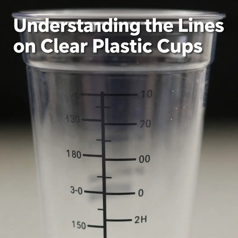
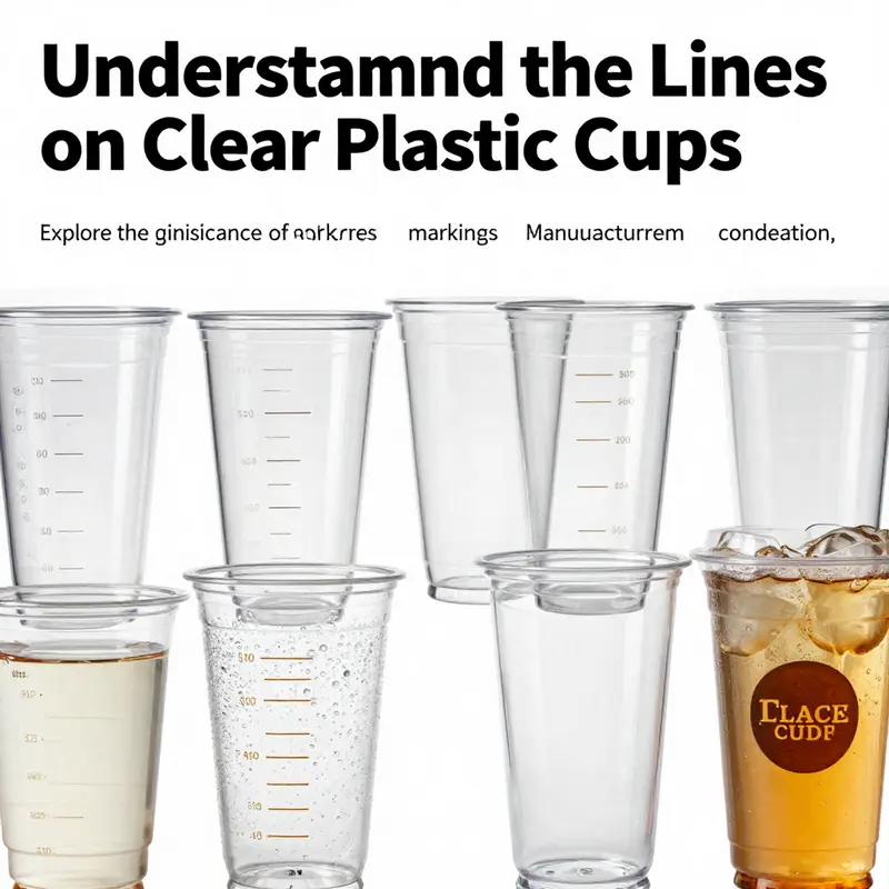
The simple act of pouring from a clear plastic cup is often an exercise in measurement as much as it is in hospitality or experiment. The presence of volume markings on these cups—graduated lines etched, printed, or molded into the translucent skin of the cup—transforms a disposable vessel into a miniature measuring tool. These lines are not merely decorative; they encode a tacit trust between manufacturer, server, and user. When a line reads 200 ml or 50 ml, it carries expectations about accuracy, consistency, and the reliability of the subsequent action—whether that action is portioning a smoothie for a school lunch, preparing a chemical solution in a quick lab exercise, or calibrating a recipe in a home kitchen. Read carefully, the markings reveal how measurement has become woven into everyday life, even in environments that prize speed and convenience as much as safety and hygiene.
The most familiar of these features are the graduated scales themselves. In many clear plastic cups designed for liquids, the scale is printed, etched, or molded into the cup’s side. The increments often range from as small as 10 milliliters up to 200 milliliters, though designs vary by region, industry, and intended use. The readability of these markings depends on several factors: the density and contrast of the lines, the clarity of the plastic, and the viewing angle. When a user holds the cup at eye level, the meniscus—the curved surface of the liquid—sits against the markings, allowing a quick, intuitive read. A well-executed scale reduces the cognitive load of measuring, turning what could be a guess into a confident, repeatable judgment. In busy cafeterias, laboratories, or home kitchens where timing and accuracy matter, that contrast is more than a convenience; it is a safeguard against under- or over-dosing, under- or over-diluting, and the small errors that accumulate with repeated trials.
The choice of material is not incidental to this functionality. Most clear measuring cups are fashioned from chemical-resistant polypropylene (PP), a thermoplastic valued for its durability, chemical inertia, and resilience to temperature changes common in cooking and basic lab work. PP’s clarity supports readability; it does not haze easily, and its surface can occasionally be treated to enhance durability or provide a subtle tactile cue for grip. Even when the liquid inside is opaque, the external markings remain legible because the lines do not rely on color contrast alone; they exist within the structure of the plastic itself. For those who handle edible liquids or non-toxic substances, the food-grade grade of PP adds a layer of safety. In settings where repeated use is expected, PP provides a robust alternative to fragile glass, reducing the risk of breakage without sacrificing the visibility of the scale through the cup’s walls.
The way a line is formed—etched, printed, or molded—speaks to the manufacturing choices behind reliability. Etched marks offer durability; they become part of the cup’s surface, resistant to wear even after repeated washings. Printed markings may offer more flexibility in appearance, permitting color or style variations that align with branding or product line design. Mold lines, the subtle seams where halves of a mold meet, can sometimes intersect with measurement in visually deceptive ways. In well-made cups, those seams are kept away from the measuring area and smoothed to a point where they do not disrupt line interpretation. Advances in tooling and material flow control minimize these seams and ensure the scale remains evenly spaced, with tolerances tight enough to keep a 10 ml increment consistently readable across thousands of units. The practical effect of these manufacturing choices is a dependable scale that readers can trust over many uses, even in demanding environments.
The utility of volume markings extends beyond mere portioning. In culinary contexts, precise measurements contribute to consistency—think of a recipe that relies on a specific amount of water, stock, or extract at a given stage. In beverage service, exact pours translate into standardized servings, cost control, and predictable customer experiences. Yet the same markings that guide a barista or a chef also invite curiosity in a laboratory or educational setting. A student might use a 50 ml line to measure a reactant for a quick demonstration, or a researcher might clip a disposable cup into a broader workflow that requires discrete volumes to be tracked rapidly. In both worlds, the visual clarity of the scale matters as much as the physical durability of the cup. The cup becomes a portable measuring tool, a tiny instrument whose lines encourage discipline in observation and execution.
When we consider the human factors at play, several guiding principles emerge. Spacing between lines is a critical design choice. If increments are too close together, the eye can misread a level, particularly when a cup’s surface is curved and light refracts around the liquid’s meniscus. If increments are spaced too far apart, the cup loses granularity, making it harder to nail a precise volume for tasks that require midpoints or small adjustments. The ideal is a balance: a scale that reads quickly at a glance, yet offers enough subdivision to support accuracy when a measurement matters. The color and thickness of the lines also influence legibility. A light, crisp mark on a translucent backdrop tends to outperform a darker line on a tinted surface, because glare and reflections can obscure a heavy line. In high-traffic settings, these choices are not cosmetic; they reduce cognitive load and error, especially when personnel multitask or when users are wearing gloves.
There is also a matter of interpretation. The curved geometry of a cup means that what looks like a perfect alignment may vary with perspective. Line-of-sight, the angle at which one views the markings, and even the cup’s own tilt as it rests on a table all contribute to perceived accuracy. Users learn to bring the cup to eye level and read the level where the liquid intersects the scale. In some training settings, instructors emphasize reading the meniscus against the nearest major tick rather than a minor subdivision, a practice that minimizes parallax error. In other contexts, especially where small adjustments matter, the minor increments are read with careful attention to the needle-sharp edge of the line. This discipline, learned through practice, fosters a habit of precision that extends beyond the cup itself into broader workflows where measurement is essential.
The design and application of volume markings are not uniform across brands and markets, and that variability can influence how users interact with cups. Some lines are designed primarily for quick, approximate pouring in social or food-service contexts. Others are engineered for scientific or educational purposes, where the increments reflect more stringent tolerances. The same cup can thus exist in a spectrum of roles, its markings serving different purposes depending on the task at hand. In environments where both cooking and small-scale experiments share equipment, the presence of a clear, well-spaced scale can bridge the gap between culinary improvisation and controlled measurement, enabling a smoother transition from one discipline to another. In this sense, the marking is not simply a measurement aid; it is a rhetorical device that communicates the intended use of the cup and sets expectations for user behavior.
From a sustainability perspective, the use of clear plastic cups with reliable volume markings also intersects with reuse and hygiene practices. Clear PP cups designed with durable markings encourage repeated use in settings like schools, laboratories, or event venues where washing and reusing containers is common. The markings must withstand cleaning processes without fading or smearing, preserving readability over time. This durability supports not only accuracy but also safety, reducing the likelihood that a user misreads a deteriorated label and misjudges a serving or a sample’s volume. In addition, the manufacturing choice to invest in high-quality markings can lower the lifecycle cost of a given supply chain by decreasing waste associated with mismeasured portions, mispouring, or the premature disposal of cups whose scales have worn away. As venues and facilities seek to balance practicality with environmental responsibility, the reliable readability of volume markings becomes part of a broader conversation about material choice, product lifespan, and end-of-life considerations.
The conversation around markings also invites a closer look at how lines coexist with other features on a cup. In many designs, there are decorative or branding lines that run around the circumference or near the rim. These should be distinct from the measurement lines to prevent confusion. A well-conceived cup separates function from form: the practical lines must not be conflated with stylistic signals. When brands attempt to weave multiple layers of information into a single visual field, the risk is reader fatigue, especially in fast-paced service environments. In the best cases, the measurement scale remains unambiguous while branding lines provide a subtle, tasteful frame to the content. The result is a tool that respects both the science of measurement and the art of presentation.
Even in informal contexts, the importance of clear markings should not be underestimated. A parent portioning juice for a child, a teacher setting up an experiment with a classroom cup, or a home cook adjusting a marinade all benefit from reliable graduations. The cup, once thought of as a disposable utensil, becomes a reusable instrument, a small but steady ally in daily tasks that require a quantifiable approach. The experience of using these cups without ambiguity contributes to smoother workflows, less waste, and a sense of confidence in execution. In that sense, volume markings matter not only to the accuracy of a single pour but to the larger habits of precision that people bring to kitchens, classrooms, and laboratories alike.
To illustrate how this function translates into practical outcomes, consider a kitchen scenario. A cook aiming for a brine solution or a stock reduction might use a cup marked at 50 ml to measure a concentrate, ensuring the total volume aligns with the recipe’s target. In a lab-type setting, a student might pour a dye or reagent up to the 20 ml line to achieve a standard working solution. In both cases, the lines serve as a bridge between the visible liquid and the invisible quantity it represents. They translate a physical cue—the rise of the liquid—to an exact numeric value that informs the next action. This translation is not automatic; it depends on the caregiver-like attention we bring to reading the scale, the cup’s construction, and the environment’s lighting. The more robust the markings, the less mental gymnastics required to arrive at a correct measurement, leaving room for the other aspects of the task at hand—timing, temperature, texture, and flavor, or solvent strength and concentration.
As with any object shaped by both utility and economy, there is a subtle balance between standardization and customization. A standardized set of graduated lines promotes predictability across institutions and vendors, enabling staff to train quickly and users to transfer skills between stations or stations between shifts. Customization, meanwhile, can align a cup’s scale with specific workflows, such as a culinary school’s preferred sequence of measurements or a laboratory’s need for particular increments in a colorimetric test. The capacity to tailor scales—whether by adjusting increments, extending the range, or adding auxiliary marks—demonstrates how volume markings can be more than static features. They can be adaptable tools that reflect the demands of their users while preserving the core attributes of clarity, safety, and durability. In this view, markings function as a versatile interface between human intention and material reality, hiding in plain sight as the everyday act of pouring becomes a precise, repeatable practice.
For readers seeking a concrete example that echoes this discussion of readability and practicality, consider exploring a product page that showcases clear cake cups designed for desserts. The page demonstrates how a clear cup can maintain readability of markings even in a crowded, event-driven setting, where contrasts between light, drink, and surface reflections matter. See the page here: clear cake cups for desserts. This reference offers a glimpse into how form and function converge in real-world applications, illustrating how the scale, the surface, and the geometry of the cup interact to deliver reliable measurements under practical conditions.
In closing this exploration of line and measurement, it is worth emphasizing that volume markings on clear plastic cups are not an isolated feature. They are part of a larger ecosystem of design decisions that affect how people measure, pour, and mix. The choice of material, the precision of the marking process, and the cup’s geometry all contribute to a user experience that can be intuitive and forgiving or exacting and precise. The implications ripple outward into the reliability of recipes, the safety of handling, and the efficiency of operations in busy settings. As industries continue to adopt and adapt plastic solutions for a range of tasks, the volume markings on these cups remind us that accuracy can be both simple and elegant when the lines are thoughtfully conceived and carefully executed. The cup becomes more than a container; it becomes a tool that quietly supports correct practice, reduces waste, and reinforces a culture of careful measurement in everyday life. External resources and product literature continue to refine these practices, but the core idea remains clear: lines matter when the quantity behind them matters.
External reference on measurement-ready plastic cups: https://www.alibaba.com/product-detail/10ml-100ml-clear-plastic-measuring-cups_1600549738982.html?spm=a2700.1.w1.1.6b2c7a5e1f7b7a3d9e3b
Between Two Halves: The Hidden Craft of Minimizing Mold Lines in Clear Plastic Cups
The glassy surface of a clear plastic cup can seem almost alive in the right light, a quiet transparency that invites interpretation of what lies within. Yet behind that seeming simplicity lies a sequence of precise, human-made decisions. In the world of injection-molded cups, the visible seams and mold lines are not mere imperfections; they are the fingerprints of the process, the visible trace of two halves meeting, of heat and pressure guiding molten polymer into a precise shape, and of the compromises that manufacturers must navigate to preserve clarity. When a cup is held up to a light, the eye may still register a line. In a crowded cafeteria or a dimly lit event hall, that line can shift from a minor nuisance to a perceived degradation of quality. The engineering truth is that some degree of a seam is, by design, unavoidable. What matters is how it is managed, made less conspicuous, and, ideally, rendered indistinguishable from the surrounding crystal-clear surface. That is the central challenge of this chapter: translating the physics of molding into a finished product whose transparency feels continuous, seamless, and trustworthy to the human eye.
The origin of mold lines in clear cups starts at the moment the designer decides how the parting line—the seam where the two halves of the mold meet—will be positioned. In transparent PS cups, the line can fall across a region that catches the light and becomes more noticeable, especially when the cup is viewed against bright backlighting or a contrasting background. Designers and process engineers, therefore, work from a simple premise: place the seam where it is least perceptible in normal viewing conditions. This often means routing the parting line toward the base, or along an inner side, rather than across the central, most visible plane of the cup. A well-considered parting-line strategy reduces the risk that the seam will interrupt the otherwise uniform optical path of light through the polymer. The logic is not merely aesthetic; it is functional. A seam that runs across the main viewing area can become a focal point for the eye, distracting from the cup’s clarity and, in a service setting, signaling lower-quality manufacturing to the consumer. The design guide for transparent cups, drawn from industry practice, emphasizes that the mold structure must be simple enough to achieve precise alignment across all cavities. An up-down mold arrangement with independent cavities, when executed with meticulous tooling and alignment, tends to yield fewer inconsistencies that would otherwise betray themselves as visible lines in the finished product.
Yet a seamless surface is not guaranteed by parting-line placement alone. The second major pillar in the quest for clarity is precision machining and constant mold maintenance. The mating surfaces that close the two halves must fit with microscopic precision. Any gap, even a fraction of a micron, can become a site for flash—the tiny excess of material that exudes at the parting line during injection. Flash not only creates a tangible ridge along the seam; it also scatters light in unintended ways, making the line appear bolder under certain lighting. Routine polishing of the tool steel, careful deburring, and a rigorous cleaning regimen are not optional steps; they are prerequisites for maintaining smooth, clean interfaces. Debris, in particular, is the enemy of clarity. A speck of dust or a particle from a worn guide pin can imprint a small mark that is visible on the clear surface as the cup is translated from the mold to the cooling station. When viewed through a beverage, such marks can resemble scratches or micro-fissures, triggering a perception of weakness or inferior construction. The best facilities implement a disciplined mold-cleaning protocol, often running periodic mitigations for any sense of residual contamination, and they invest in durable coatings and surface finishes that resist wear across high-volume production cycles.
Even with a well-placed seam and pristine tooling, the real-world physics of injection molding can create conditions that elevate the visibility of line features. The speed and pressure of the injection, the rate of material fill, and the duration of the hold phase all influence how evenly polymer fills the tiny crevices at the joint. If the polymer is driven too aggressively into the joint, the gap at the parting line can become a channel for flash or flow marks, which coalesce into a visible dorsal line along the circumference of the cup. Conversely, inadequate cooling can cause the part to warp just enough that a seam becomes more conspicuous when light passes through it. The art here is to balance these parameters with an eye toward optical clarity. Many producers implement a middle-core-pulling technique—often described in manufacturing glossaries as central ejection—to avoid the kind of mechanical scraping and edge-stressing that can accompany other ejection methods. This approach reduces residual stress near the rim and can prevent subtle distortions that would otherwise propagate as visible lines. It is a reminder that even seemingly minor process tweaks—how a mold opens, how long a core is held, and how the part is ejected—can leave a measurable impression on the final surface, especially in transparent materials where the eye is highly sensitive to any disruption in the light path.
The question then becomes how to select materials and control the conditions to harmonize moldline suppression with other performance metrics. Polystyrene remains a mainstay for transparent cups due to its clarity and rigidity, but it does demand careful processing to avoid defects. The molecular geometry of the resin, its melt flow characteristics, and its interaction with the mold’s cooling profile determine how uniformly the polymer fills the cavity and how consistently the surface finishes across thousands of units. A resin with excellent flow can reduce the risk of thin-wall areas around the seam, where variations are most likely to become visible. However, higher flow must be managed with appropriate cooling to prevent warping or recovery that could magnify the seam’s presence after solidification. Material selection, therefore, is not merely a question of colorlessness but of a symbiotic relationship with the mold geometry and the machine’s capabilities.
Beyond the machinery and materials, the facility’s process control culture plays a decisive role. Skilled technicians monitor the cycle times, temperatures, and pressures with a sensitivity that might seem almost instinctive to seasoned operators. Even a well-calibrated press can drift; however, the combination of robust process windows and automated inline inspection can catch subtle changes before they translate into visible lines on the cups. Inline metrology, optical quality checks, and sample-based acceptance criteria weave a feedback loop that keeps the seam from crossing the threshold of perceptibility during high-volume runs. This is not a matter of chasing perfection but of managing an acceptable tolerance band in which the cup remains visually continuous under typical viewing conditions. The language of quality, in this context, is nuanced: it speaks to how true the surface remains under specular lighting and how well the product passes the human-eye test when a customer looks at it in a restaurant or at a home gathering.
Design choices do not occur in isolation. They ripple outward to influence downstream handling and consumer perception. A seam location that minimizes visibility in the main viewing plane can still interact with other features of the cup, such as its rim geometry, bead profiles, and any texture near the base. A prominent seam at the base, for instance, might be difficult to perceive when the cup is held upright in a normal drinking position, but under certain angle light it can catch and scatter light, creating a faint outline that invites the viewer to notice it. Conversely, a seam tucked along the inner side may remain nearly invisible when the cup is viewed directly but could become more apparent when the cup is tilted toward a light source at an angle. These subtleties underscore a broader truth: the human observer’s environment—lighting quality, background contrast, and even the beverage’s color and opacity—can alter how a seam is perceived. It follows that manufacturers must consider typical service contexts when evaluating potential seam placements during the design phase.
Another layer to the discussion concerns the trade-offs involved in mold-line minimization. Some strategies that suppress seam visibility can introduce manufacturing complexity or marginally increase cycle times. An up-down mold with more intricate core-pulling mechanics may demand more sophisticated equipment and higher tooling costs. When a production line runs at scale, even a small increase in cycle time per cup can accumulate into a significant difference in throughput and unit cost. The challenge, then, is to optimize the design and process in a way that yields perceptible improvement in optical clarity without sacrificing reliability or efficiency. Engineers often navigate this trade-off by iterative prototyping, witness samples, and targeted adjustments to the gating system, runner design, and venting. The goal is to achieve a stable, repeatable process where the seam remains consistently tucked away from the viewer’s primary line of sight while maintaining dimensional accuracy, wall thickness uniformity, and surface gloss.
Within this framework, it becomes clear why the topic of mold lines is tightly bound to the broader discourse on lines on clear plastic cups. Volume graduations etched or printed on the side, branding bands, or condensation lines can all interact with seam features in ways that influence perceived quality. A visible line that marks a measurement can amplify the eye’s awareness of any other line in the vicinity, including a seam. Conversely, an exceptionally clean, uniform surface can make a well-managed seam barely noticeable, allowing the cup to convey the impression of uninterrupted transparency. This is a reminder that technical decisions in manufacturing rarely stand alone; they participate in a complex visual ecosystem. The chapters that follow will explore other kinds of lines—such as the practical lines used for measuring portions, or the environmental lines that emerge when cold beverages meet the warm air of a room—and will trace how each category interacts with the materials, the form, and the manufacturing narrative of the cup.
For readers curious about practical examples of the type of product under discussion, one may explore an in-situ representation of disposable clear plastic cups designed for events and everyday use. The link below points to a real-world embodiment of the category described here, where the cups are made to balance clarity with manufacturability in high-volume settings. disposable clear plastic cup for parties and picnics. This resource illustrates how manufacturers frame their design choices around optical clarity, process robustness, and consumer expectations in environments where light and attention are constantly shifting.
In sum, the visible lines on a clear plastic cup are not just cosmetic blemishes; they are the tangible outcomes of a highly constrained design space. Parting-line placement, mold geometry, and the stabilization of processing conditions together determine whether a seam will intrude upon the cup’s clarity or vanish into the surface. The discipline requires a synthesis of mechanical precision, material science, and perceptual psychology to deliver a product that satisfies both the eye and the hand. As production lines push toward ever-greater throughput, the aim remains the same: to preserve the crystal clarity that makes a clear cup not merely a vessel for liquid but a window through which the drink and the moment are meant to be experienced. For researchers and practitioners, the lesson is clear. Seams are not merely manufacturing byproducts; they are design constraints with perceptual consequences. Understanding their origins and mastering their management yields cups that look as if they were molded in a single, flawless moment. For those who will study the science of lines on clear plastic cups in more depth, an external overview of injection-molding practices provides a broader technical frame for these micro-level decisions. See the external resource for a broader technical overview: Injection Molding resource.
Frosted Boundaries: Condensation Lines on Clear Plastic Cups as Windows into Heat, Humidity, and Everyday Physics
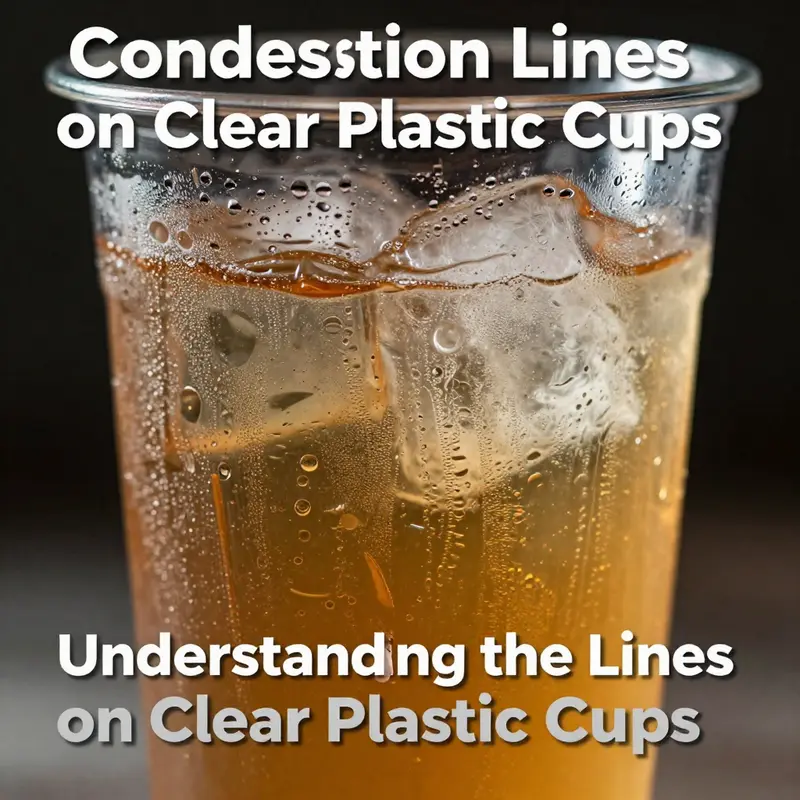
Condensation lines on clear plastic cups are more than a fleeting visual cue of a cold drink. They sit at the intersection of everyday life and basic science, offering a tangible demonstration of how heat moves, how humidity behaves, and how materials respond to rapid temperature changes. While many people notice the droplets gathered along the cup’s exterior after pouring a chilled beverage on a warm day, the lines themselves tell a layered story about surface temperature, air moisture, and the imperfect insulation that characterizes common packaging. To understand these lines is to glimpse how a simple container becomes a small laboratory, revealing the physics of phase change in a format that is accessible to students, servers, and curious observers alike. In the broader arc of lines on clear plastic cups, condensation lines stand apart because they arise not from the cup’s manufacturing process or its branding, but from a transient exchange across a boundary between warm, moist air and a surface cooled by a liquid. The lines remind us that the cup is not an inert vessel; it participates in a dynamic exchange of energy with the surrounding environment, and that exchange leaves a signature visible to the eye and measurable in principle to the trained observer.
When a cold liquid meets a warm, humid atmosphere, the exterior of the cup acts as a heat sink for a moment. The surface temperature drops rapidly, and the air in contact with that surface, still rich in water vapor, cools as well. As the air cools, its capacity to hold water vapor diminishes, and droplets begin to form on surfaces where the air is saturated or near-saturated. On a smooth, curved surface like a clear plastic cup, these droplets do not fall uniformly; instead they nucleate at microscopic irregularities, tiny ridges, or surface imperfections and then coalesce into small streams that appear as faint lines circling the cup. The pattern of these lines is a snapshot of microclimates that exist along the cup’s circumference. They may run as a continuous ring at mid-height, or as intermittent bands below the rim, where the interaction between the liquid’s temperature, the cup’s curvature, and the ambient air enters a subtly different regime. The human eye reads these patterns as “lines,” but scientifically they are dynamic halos of water in the process of condensation, a reversible phase change that is as much about surface science as it is about weather inside a cup.
A crucial distinction lies between condensation lines and the lines that can appear on a cup for other reasons. The latter might be manufacturing seams from the molding process or branding elements etched into the surface. Seams occur where mold halves meet and can be visible as faint vertical or circumferential lines. They are structural, a byproduct of how the cup is fabricated, and they persist regardless of the liquid inside. Branding lines, on the other hand, are design features—deliberate marks or bands that complete a logo or color story and remain static through use. Condensation lines, by contrast, are contingent on the beverage’s temperature, the ambient humidity, and the cup’s material properties. They appear only when the right combination of cooling and moisture exists. Recognizing this difference is not merely pedantic. It helps educators and technicians communicate more precisely about what is being observed, whether the goal is to analyze a demonstration, to troubleshoot packaging performance, or to ensure that a display cup remains a faithful representation of a product’s intended use.
The material that makes most clear plastic cups, often a form of polyethylene terephthalate (PET) or a related polymer, conducts heat more readily than glass or metal. This relatively low insulating ability means the outer surface of the cup can reach a temperature well below the ambient air temperature when filled with a cold liquid. The rate of heat transfer from the liquid through the cup wall to the exterior is a function of wall thickness, the thermal conductivity of the plastic, and the contact between the liquid and the inner surface. In practical terms, a chilled beverage cools the cup quickly on the outside, especially on a day with high humidity and a warm surrounding air mass. As the outer surface drops in temperature, the air just outside that surface can no longer hold all the moisture it contains, and condensation forms. The lines become visible not because water climbs the cup, but because the air adjacent to the cup becomes supersaturated and cannot shed its moisture fast enough as it brushes against a colder boundary. This is the essence of the phenomenon: a boundary condition in which environmental humidity and material cooling converge at a precise moment.
Environmental conditions exert a strong influence on how pronounced these lines appear. Humidity acts as the reservoir of moisture; the more water vapor present in the air, the greater the potential for condensation when a cold surface arrives. Temperature is the other decisive factor. If the liquid is very cold or if the surrounding air is warm and humid, condensation lines may become clearly visible. In a dry environment, the same cold cup might reveal only a few sparse droplets rather than a defined, continuous ring. The interplay between temperature and humidity also interacts with the cup’s surface texture. A glossy, smooth surface tends to promote evenly distributed droplets as the vapor begins to condense uniformly, whereas microtexture or a slightly rough finish can create nucleation sites that produce irregular, fern-like or banded patterns as droplets form in clusters. The curvature of the cup itself contributes to how these droplets arrange. A cylinder with a gentle radius offers a continuous path along which droplets can coalesce and migrate, potentially forming a more cohesive line. A cup with a sharper curvature or a tapered profile may encourage droplets to accumulate at particular heights, producing multiple, thinner lines rather than a single, sweeping band.
The educational value of condensation lines in a classroom or demonstration setting lies in their immediacy and their connection to core physics concepts. The phenomenon invites students to observe phase changes, energy transfer, and the role of environmental variables in everyday objects. A simple, controlled demonstration can show how changing one variable—the temperature of the liquid—alters the intensity and location of condensation lines. For instance, placing two identical cups side by side, one with ice-cold water and the other with cooler but not frozen water, can reveal how more aggressive cooling increases the surface temperature differential and thereby broadens the area of visible condensation. If the room’s humidity is adjusted with gentle steam or by placing the cups in a more arid environment, the contrast between the two cups can become striking. In this sense, condensation lines become a hands-on primer for discussions about humidity curves, dew point, and the thermodynamics of heat exchange. Such demonstrations are not merely theatrical; they anchor abstract concepts in observable phenomena and emphasize that science is not confined to laboratories but is embedded in everyday objects.
From a materials and packaging perspective, condensation lines can also inform how beverage serving and display contexts are designed. In environments where condensation droplets can lead to spills, slippery surfaces, or water damage to packaging displays, understanding when and where condensation is likely to occur helps in selecting appropriate cup materials, wall thickness, and surface treatments. It may guide decisions about whether to use insulating sleeves, whether to encourage warmer ambient conditions, or whether to incorporate microtextured interiors that can direct droplets away from the rim or toward a designated drip area. In food service operations, recognizing condensation tendencies can influence the placement of cups in displays, the timing of beverage service, and even the preparation of demonstration stations where guests observe the science at work without creating a mess. While the visible lines themselves do not speak to a cup’s safety or structural integrity, they do reflect the dynamics of heat transfer and moisture management, which, in a broader sense, touch on reliability and user experience.
One practical takeaway for observers is that condensation lines are ephemeral. They appear as long as the boundary conditions exist—cool liquid, moist air, and a surface susceptible to rapid cooling—and they disappear as conditions change. If the beverage warms, if the room loses humidity, or if the cup is moved into a drier environment, the lines fade. This transience mirrors the natural processes at work in the water cycle, where evaporation and condensation are constantly balancing in atmospheric systems. The visible lines on a cup can thus serve as a microcosmic illustration of larger ecological and physical processes, offering a bridge between everyday observation and natural science. For a broader science context that expands on these ideas, see the Water Cycle resource that explains condensation in natural terms, linking a tiny laboratory phenomenon to a global system.
For those who want to see how observation translates into a practical understanding of materials and service contexts, a thoughtful approach is to distinguish condensation lines from purely cosmetic or manufacturing features. As noted, seams from molding and decorative bands may mimic lines at first glance, but their persistence and cause differ markedly. Condensation is driven by current conditions and is unpredictable in its exact pattern. In contrast, mold lines are fixed by design and manufacturing tolerances. This distinction matters in education and in industry. It helps learners articulate what they are seeing and encourages precise discussions about surface science, heat transfer, and humidity dynamics. When the goal is to teach or communicate the invisible processes that govern everyday life, condensation lines provide a vivid, accessible example. They invite curiosity about why a familiar object behaves in a way that seems almost magical until one recognizes the physical principles at play.
The narrative of lines on clear plastic cups therefore encompasses a spectrum: from the practical realities of cup construction and brand design to the transient beauty of physics manifested in droplets and rings. It reminds us that simple objects can reveal complex interactions, and that a cup left in a warm room with a cold drink becomes a micro-laboratory that anyone can read. The next time a condensation line catches the eye, it is not merely a sign of moisture; it is a signpost pointing toward an understanding of how heat, moisture, and materials meet in daily life. And if one wishes to connect this observation with accessible purchasing choices for events or everyday use, there is a simple path to explore practical options that emphasize clarity, ease, and reliability in serving beverages under varying conditions. For instance, a readily accessible option in everyday contexts is the disposable clear plastic cup aimed at outdoor and party use; such cups are designed to balance convenience with predictable performance in a range of environmental conditions. To explore this practical angle within the broader discussion of lines on clear plastic cups, you can consult a related product listing that highlights disposable clear plastic cups suitable for outdoor and party use. disposable-clear-plastic-cup-outdoor-picnic-pet-cup-drinking-cup-for-parties-birthdays-weddings-camping-utensils.
As we consider the broader topic of lines that appear on clear plastic cups, condensation lines offer a particularly compelling instance of visible science in action. They demonstrate how the same cup can embody multiple layers of context: a physical boundary that governs heat transfer, a surface that interacts with an environment whose humidity can vary from moment to moment, and a material reality that defines how cold liquids influence the surrounding air. This layered understanding enriches our appreciation not only of the science but also of the everyday experiences that classrooms, catering events, and laboratories alike can share. By attending closely to these lines, learners can practice asking precise questions: What is the temperature difference across the cup wall? How humid is the room? What is the cup’s wall thickness and surface finish? Each question guides observation toward a more quantitative description, inviting measurements, comparisons, and perhaps even simple experiments that can be carried out with minimal equipment. In this way, condensation lines become not merely curiosities but entry points—into thermodynamics, material science, and even environmental awareness.
Ultimately, condensation lines remind us that knowledge often travels from the visible to the conceptual. A faint ring of moisture on a clear cup becomes a doorway into discussions about dew points, phase transitions, and the efficiency of heat transfer. It also offers a humane reminder of the limits and possibilities of everyday materials. If the cup’s surface can reveal the intimate dance between air, moisture, and temperature, then so too can the observers who study it learn to read those signs with care and curiosity. In classrooms, in kitchens, and at the edge of a party table, condensation lines invite us to slow down, to notice, and to connect a moment of observation with a deeper sense of how nature works—even in the most ordinary, disposable of vessels.
External resource for broader context on the science underpinning these observations can be found here: https://www.usgs.gov/special topics/water science-school/science/water-cycle-condensation. This external reference helps anchor the phenomenon of condensation in the larger framework of the water cycle, linking a visible, short-term event to long-term, planetary processes. By situating cup-level condensation within this wider scientific landscape, readers can appreciate how a small, everyday sight mirrors the universal principles that govern weather, climate, and the sustainment of life on Earth.
Branding on a Transparent Canvas: Design Lines that Elevate Clear Plastic Cups
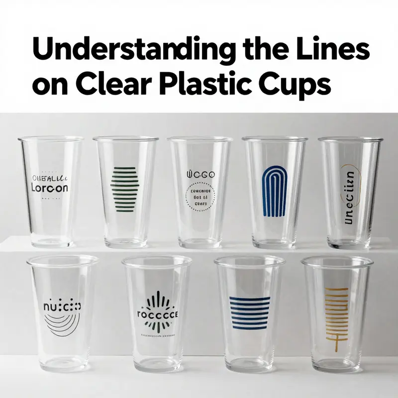
The cup is a simple vessel, yet in the hands of designers and marketers it becomes a roaming canvas, a portable classroom in which color, light, and linework collaborate to tell a story. Clear plastic cups, prized for their transparency and the unfiltered view they offer of a beverage, carry an opportunity beyond functionality. They invite a brand’s message to ride on the surface in lines that are not merely decorative but purposeful. In this space, the so-called lines on a clear cup—whether they serve a practical purpose or a purely aesthetic one—operate as a bridge between product experience and memory. They guide the eye, emphasize the drink’s hue, and anchor a moment in time at an event, a café, or a catered gathering. When brands learn to choreograph these lines with restraint and intention, they transform a disposable item into a small ambassador that travels with the consumer, whispering familiarity and trust wherever the cup goes.
The most obvious utility of lines on clear cups is the graduated scale. These markings, etched or printed along the side, are a straightforward tool for portion control. They empower servers in cafeterias and schools to dispense measured amounts, and they help guests visualize how much they have poured. Yet even these pragmatic lines carry an undercurrent of visual branding. The placement, thickness, and color of a measurement scale can mirror or clash with a beverage’s color, subtly signaling the cup’s purpose and the brand’s personality without shouting. For instance, a concise set of marks in a cool, restrained tone can convey efficiency and precision, while a more decorative emphasis on the same functional lines can soften the clinical edge and tilt the experience toward a premium, craft-oriented impression. The dual function of volume lines—part utility, part design element—reveals how cleverly lines can serve more than one job at once.
Beyond graduated markings, the very edges of the cup become opportunities for branding lines. Mold seams, often visible as a faint vertical line or a subtle texture where the halves of the mold meet, are sometimes unavoidable in mass production. They are not failures; they are artifacts of manufacturing. Savvy designers learn to work with these lines rather than fight them. They may integrate the seam into a deliberate design motif, turning a potential imperfection into a signature. In this frame, lines along the body can be used to create rhythm or frame the beverage itself. A brand might align a decorative band with the seam so that it appears as an intentional contour rather than a byproduct of production. The idea is to treat every line, whether born of process or purpose, as part of a visual language that communicates consistency and care.
The environmental nature of clear plastics makes another kind of line meaningful: condensation lines. When a cold beverage meets the cool surface of a PET cup, moisture forms and traces a temporary network of droplets that run along the side in ways that resemble abstract handwriting. These condensation lines are not planned effects; they are physical realities that can be harnessed in design practice. Designers can consider the way humidity paths interact with the surface texture or with a branded line surrounding the cup. Because condensation is reversible, it creates a fleeting moment of texture that can be leveraged in limited-edition campaigns or seasonal promotions. The phenomenon underscores a broader truth about lines on clear cups: even the most ephemeral, environmental lines can be a source of storytelling, adding a layer of dynamism to an otherwise static object.
Design and branding lines on clear cups also extend into the realm of graphics and identity. When a company chooses to print or emboss lines, they are shaping a visual cue that becomes part of the consumer’s memory. The lines may frame the beverage’s color, giving sharper contrast to a lime-green smoothie, a deep amber tea, or a cloudy pink soda. They may also serve as a boundary for logos, slogans, or patterns, guiding the viewer’s gaze to the most important elements of the brand’s message. In practice, lines are used to create a rhythm around the cup’s circumference: a thin top band that draws attention to the rim, a midsection line that anchors a central motif, or a bottom border that grounds the design in the viewer’s field of vision as the cup lowers toward the table. This is branding in three dimensions: a continuous loop around the cup that can be read from multiple angles, reinforcing recognition as the cup is held, passed, or stacked with others.
The material science behind clear cups supports these branding dreams. PET, the standard for many of these cups, offers clarity, strength, and recyclability. Its transparency is the core of the design equation because it allows the beverage—and its natural color spectrum—to be part of the brand narrative. When lines are applied to PET, they must endure ordinary handling, distribution, and varying temperatures. Print or embossment technologies range from direct-to-plastic printing to laser engraving and heat-stamped accents. Each method has implications for line quality, durability, and environmental footprint. A well-chosen line becomes a strategic asset: it can be printed with inks that resist smudging from condensation and washing, or it can be embedded in a raised texture that survives rough handling without compromising the cup’s clarity.
From a marketing perspective, branding lines on clear cups have the advantage of portability. A cup travels with the consumer through a life moment—at a game, a concert, a workplace break, or a family picnic—and the linework serves as a micro-brand touchpoint that doesn’t require a separate display or a digital interaction to register. The lines act like a tiny, mobile billboard, a brief reminder of the brand’s identity at the moment when the beverage meets the consumer’s senses. This is why many campaigns emphasize consistency across cups used in events, in-store promotions, and takeaway packaging. A single, well-executed line or band around the cup can unify multiple touchpoints, from the server station to the curbside pickup, all while preserving the visual integrity of the beverage itself.
For designers, the practical task is to balance visibility with subtlety. The most effective lines never overwhelm the cup’s clear canvas. They work in harmony with the beverage, not against it. A too-dark or too dense line can flatten the drink’s brightness or create a jarring contrast that distracts from the drink’s natural beauty. In a sense, the line must become almost invisible when the user is actively looking at the drink, yet remain legible for recognition at a glance. This paradox is where craft and restraint matter, and where materials knowledge—understanding how ink adheres to PET, how embossing interacts with surface tension, and how light travels through the plastic—becomes essential. The result is a design language that feels effortless, purposeful, and inherently aligned with the beverage’s character.
In practice, brands rarely rely on lines alone. They pair lines with color accents, typography, and negative space to craft a cohesive package. A top-line band may be paired with a narrow bottom stripe, creating a frame that anchors the cup’s silhouette while leaving the central area free for the liquid’s color to glow. The use of negative space around the lines matters as much as the lines themselves. Negative space allows the beverage to breathe visually, preventing the cup from appearing crowded and ensuring that the design remains legible from a distance or in quick-service environments. This consideration is especially important in high-traffic venues where cups pass quickly from hand to hand. In such contexts, the lines must perform at speed, delivering instant recognition and a sense of brand personality in a fraction of a second.
From a sustainability viewpoint, the practical choice of lines also communicates values. When brands opt for minimalistic line work and rely on single-pass printing or simple embossing, they reduce the footprint associated with production. Conversely, intricate embossing or multi-layer printing may convey premium positioning, but it must be weighed against resource use and end-of-life recyclability. The best lines marry aesthetics with responsibility, reinforcing the idea that beauty and care can coexist with environmental stewardship. In the end, the design language of a clear cup is not merely about making something look good; it is about making something that feels right to hold, to sip, and to share in ordinary moments that become memorable.
The practical implementation of branding lines on clear cups often begins with a thoughtful design brief that translates brand values into a legible, repeatable motif. Designers consider where the line will sit relative to the rim and the base, how it will respond to the curvature of the cup, and how it will interact with the cup’s embossed features. They test various line weights, proximities, and color options against multiple beverage colors to anticipate legibility in real-world conditions. In doing so, they acknowledge that a clear cup is not a blank sheet but a living surface that responds to temperature, lighting, and the person who holds it. The result is a design system that remains coherent across different sizes, volumes, and configurations, ensuring that a brand’s line work stays recognizable whether the cup is 8 ounces or 16 ounces, whether it contains a bright fruit infusion or a dark, roasted coffee blend.
Within the broader ecosystem of packaging and disposable ware, lines on clear cups also reflect a conversation about how brands present themselves in spaces like trade shows, festivals, and temporary venues. In these settings, cups are not just containers; they are ambassadors that travel among thousands of attendees, each moment of contact an opportunity to reinforce identity. The line choices—whether they shout with bold color or whisper through refined geometry—contribute to a consistent brand narrative that participants remember as they collect mementos, share photographs, or carry the cups into social spaces. A well-executed line becomes part of a memory knot: the moment when a beverage color meets a curved surface and the viewer’s mind recognizes a logo, a motif, or a statement as part of a trusted, familiar experience.
The chapter’s research materials emphasize how the strategic use of lines on clear cups integrates branding with functionality. The clarity of PET makes the linework legible without compromising the beverage’s visibility. The balance between print and texture enables campaigns to choose between flat, high-contrast markings and tactile, embossed features that catch light differently as the cup is rotated. Innovative techniques—embossed distortions, abstract textures, and optical effects—invite observers to engage with the cup from multiple angles, creating a sense of depth and movement that enhances perceived value. When these features are deployed thoughtfully, they do more than advertise; they elevate the user experience by inviting a closer look, a longer gaze, or a more deliberate sip.
In the end, the design and branding lines on clear plastic cups embody a broader principle: packaging can be economical without feeling disposable, and appearance can be both practical and poetic. The most effective lines do not shout for attention; they invite it, guiding the eye toward the beverage’s clarity and the brand’s essence. They acknowledge that the cup is a liminal space—between the drink and the consumer, between the event and the memory, between function and story. As such, lines on clear cups are worthy of careful planning, testing, and refinement. They deserve to be treated as precursors to the moment when a guest lifts the cup, looks through the transparency, and encounters a brand’s voice reflected in the cup’s circumference.
For practitioners seeking to translate this philosophy into action, the path is practical as well as aspirational. Start with a design language that respects the cup’s natural clarity and the beverage’s color. Choose printing or embossing methods that will endure the cup’s journey from production line to table to transport. Consider the audience and the venue: in a fast-paced setting, minimal, high-contrast lines are easier to read at a glance; in a curated event, more nuanced linework can convey sophistication. The goal is to harmonize lines with the cup’s shape, the liquid’s mood, and the audience’s expectations. And always remember that the lines are part of a continuum, not a single touchpoint. They must fit into a broader branding system that includes typography, color palettes, and patterns across all disposable and reusable components used in the same campaign.
In this sense, the lines on clear plastic cups become a study in translating a brand’s identity into three dimensions. They teach that clarity is not merely a physical property of the material but a design principle: lines should illuminate, not obscure; structure, not clutter. When this discipline is applied, the cup ceases to be a one-use object and begins to function as a small-scale, portable embodiment of a brand’s character. The beverage inside remains the focal point, but the lines around it, the way they catch light, and the way they align with the liquid’s hue, all contribute to an experience that lingers beyond the final sip.
Thus, as you move through the chapters that follow, keep in your mind the image of lines as more than labels or borders. They are a language—precise, adaptable, and human in their warmth. They can signal efficiency, sophistication, playfulness, or warmth, depending on how they are drawn, where they sit, and how they interact with the drink’s color and the observer’s gaze. The story of lines on clear cups, then, is not just about printing techniques or material choices; it is about how small design decisions ripple outward to shape perception, behavior, and memory. It is about giving a disposable shape a moment of meaning, an artifact that can be reused in minds long after the cup’s contents have been enjoyed. And in that sense, the cup’s transparency becomes a metaphor for brand transparency: a clear surface that reveals, with minimal intervention, what lies within and what a brand stands for when it presses its line into the everyday.
For teams working on events, campaigns, or product launches that hinge on visual impact and practical utility, the design of lines on clear cups offers a compact set of decisions with outsized effects. There is value in testing line thickness against line color, ensuring legibility across lighting conditions, and aligning line placement with the cup’s geometry to create a cohesive rhythm. The interplay between lines and beverage color can turn a simple drink into a showcase—an opportunity for the consumer to experience color in a new way as it moves through the glassy, reflective surface. The lines become not just marks on plastic but cues that help the eye and memory travel together toward a shared moment of recognition and appreciation.
If you are exploring this territory, consider how you might reference the ideas embedded in contemporary practice while staying within sustainable and responsible design choices. The use of a single, well-executed line in a restrained palette often communicates more than a busy pattern. It reads as confidence and care, a signal that the brand understands the consumer’s time and attention. And when those lines are coupled with a thoughtful, tested approach to beverage presentation—how the drink’s color behaves under different lighting, how condensation adds texture, how the cup’s weight feels in the hand—the design moves from mere decoration to an integral part of the product experience. In this integrated approach, a clear cup becomes both vessel and message, a passing story that the user can interpret in their own way while still receiving a consistent, brand-defined impression.
To close this thread, the chapter emphasizes a core idea: lines on clear plastic cups matter precisely because they sit at the intersection of function and feeling. They are not afterthoughts but deliberate tools that shape perception, extend branding into physical space, and help beverages present themselves in the most compelling way possible. When designers treat these lines with respect for material, context, and user experience, they unlock a subtle power—the power to influence a moment of consumption so that it feels intentional, memorable, and shareable. And in a world where a cup can travel through countless hands and scenes, those lines carry a continuity that anchors a brand in the user’s memory long after the drink is gone.
Internal link reference for designers seeking practical paths forward guides them toward examples of clear cups used in event environments. It provides a concrete starting point for prototyping linework in real-world settings and evaluating how different line strategies interact with beverage colors, lighting, and hand movement. For further inspiration and practical considerations, explore the concept of a clear cup as a design surface in the context of ready-to-use packaging solutions. clear plastic cups for events.
External reference and further reading about the visual impact of branding lines in disposable ware can be found in contemporary visual marketing case studies and related research. These sources illuminate how subtlety and texture can elevate perception without compromising sustainability. External resource: https://www.pinterest.com/pin/123456789012345678/
Final thoughts
Understanding the lines found on clear plastic cups offers significant insights for bubble tea shops, beverage chains, and catering services. Volume markings enhance accuracy, manufacturing seams indicate production quality, condensation lines provide a visual cue of beverage temperature, and design lines elevate branding opportunities. By recognizing the function and value of these lines, businesses can better communicate quality, care, and professionalism in their beverage presentations. Ensuring that your plastic cups effectively integrate these features can contribute positively to customer satisfaction and brand loyalty.