
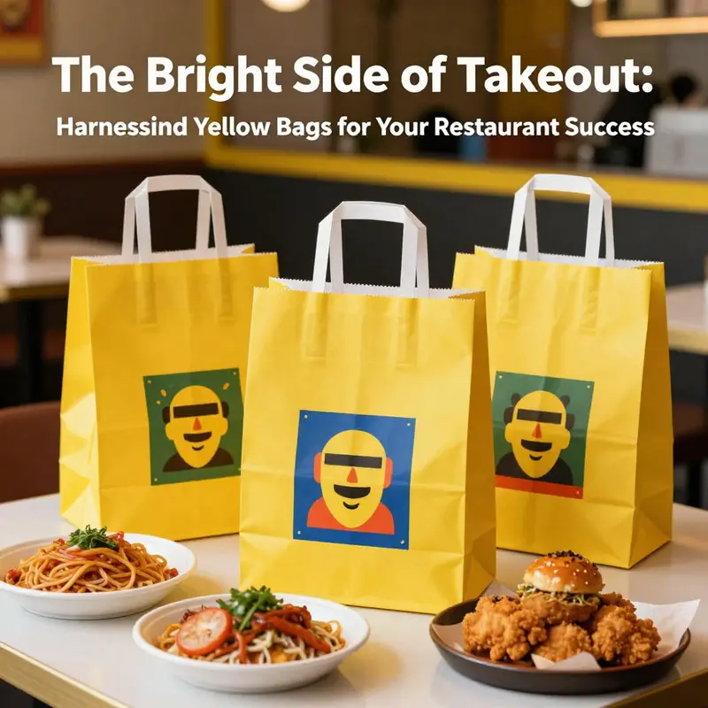
Color plays a significant role in brand recognition and customer appeal, particularly in the competitive landscape of food service. Among the myriad choices available, yellow takeout bags have emerged as a standout option. Their vibrant hue not only captures attention but also aligns with food safety measures which are increasingly important for consumers. This article explores the diverse roles yellow takeout bags play in a restaurant’s branding strategy, their significance in maintaining food safety compliance, and how market trends are moving towards customizable options. By delving into these chapters, readers will gain a comprehensive understanding of how these bags can enhance their business operations and customer engagement.
Bright Couriers: Branding, Visibility, and the Power of Yellow Takeout Bags in the Modern Restaurant
The road from kitchen to customer doorsteps is not just a pathway of food; it is a corridor lined with signals that quietly shape perceptions. Among those signals, yellow takeout bags stand out like a flare. They do more than carry meals from one place to another. They whisper the restaurant name, set expectations about the experience inside, and travel through neighborhoods as mobile advertisements that extend the dining room beyond the four walls. In an industry where a momentary glance online can turn into a loyal patron or a fleeting impression that dissolves on a crowded street, the color of the packaging becomes a strategic tool. Yellow, with its high visibility, acts as a beacon in a sea of boxes and bags, helping a brand insert itself into the visual noise of busy urban life. Yet this is not simply about shade and saturation. The choice of yellow intersects with branding, psychology, safety signaling, and practical delivery considerations, weaving together a coherent story of how a restaurant can leverage color to influence memory, trust, and behavior in real time.
The most immediate effect of yellow packaging is recognition. In a landscape where countless meals share the same shape, size, and material, color becomes a shortcut for memory. A diner who has had a consistent experience at a particular place will begin to associate the vivid yellow with the sensations of that meal—the warmth of the broth, the brightness of the vegetables, the crispness of the finish on a fried edge. The bag becomes a portable version of the brand identity. When customers encounter a yellow bag on a doorstep or at a drop-off point, they are more likely to recall the dining experience that preceded it and to trust that the moment on their plate will resemble what they remember from a prior visit. This connection, built through repeated exposure, is the essence of brand recall. It is not merely about getting seen; it is about becoming familiar enough to be anticipated.
A unified visual identity hinges on how color works with other branding elements. When yellow is paired with a distinctive logo, a clean typeface, and a carefully chosen accent palette, the result is not a shouting color but a coherent signal. The bag becomes a three-dimensional canvas that communicates mood as well as message. Warm hues, for instance, can suggest comfort and speed, implying that the restaurant delivers not just food but a comforting experience—fast when needed, reliable when it matters. The bag supports the other touchpoints customers encounter, from menus to storefront signage to the app interfaces that guide ordering. In this way, yellow serves as a throughline that binds together storytelling across channels. The packaging acts as a visual handshake that promises consistency from curbside pickup to home dining.
Crucially, the practicalities of delivery reinforce why yellow is an apt choice. Modern delivery packaging is not just about catching the eye; it is about maintaining temperature, protecting food integrity, and communicating safety. Insulated bags in bold yellow are more than branding; they are a functional tool. They shield hot foods from premature cooling and cold items from heat intrusion, helping to preserve textures and flavors that customers expect. A well-designed bag earns its keep by reducing the risk of a compromised delivery, which in turn supports positive word of mouth and repeat orders. The color itself becomes a signal of preparedness: a yellow container suggests that the restaurant has considered the journey as part of the dining experience, not just the moment of cooking. In markets where delivery is the primary channel, this signaling can translate into higher perceived value and less anxiety about the food arriving in subpar condition.
Beyond the color, the bag carries a broader social signal about safety and transparency. In many places, a security seal or a visible indicator attached to the bag is used to reassure customers that the contents have not been tampered with. While these yellow seals are technically a separate feature from the bag itself, the common pairing of yellow bags with visible safety indicators reinforces a narrative of transparency. Customers learn to expect certain cues—bright color, clear branding, and tangible signs of safety—each time an order arrives. The effect is a heightened sense of trust that the restaurant is accountable for quality from the moment of packing to the moment the package is opened. In this way, yellow packaging transcends aesthetics and becomes a conduit for trust-building in a marketplace that prizes reliability.
The sourcing and customization of branded yellow bags are also part of the narrative. Restaurants can leverage bulk orders to achieve a consistent look across a wide footprint, from brick-and-m mortar locations to emerging delivery-only concepts. The design process often includes decisions about insulation, material durability, heat resistance, and waterproofing—all of which must harmonize with branding. A yellow bag designed to accommodate hot foods with a reliable seal, while carrying a bold logo and crisp typography, communicates efficiency and care. Customization allows the bag to carry not only the restaurant name but also key messages about values, such as sustainability, known for freshness, or a commitment to local ingredients. The result is a packaging ecosystem in which each bag reinforces a coherent brand story, whether encountered on a kitchen counter, at a courier handoff, or in a customer’s hands as they unwrap a meal at home.
The relationship between color and psychology plays a central role in shaping customer perception. Yellow is associated with warmth, happiness, and energy in color psychology research. It hints at sunshine and renewal, channels positive emotions, and can elevate the mood at the moment of eating. This perceptual boost matters more than it might seem at first glance. A customer who feels lighter and more upbeat is more likely to interpret the meal as satisfying and fresh. The impression of value can be amplified when the yellow bag aligns with the interior atmosphere of the restaurant—bright lighting, a lively color scheme, and a friendly service style. The effect is a halo around the brand that persists as the carryout bag travels through the city, creating a memorable snapshot that customers can recall later when they decide where to order next.
The practical and psychological dimensions of yellow packaging intersect with broader questions of brand loyalty and discovery. When a brand uses a consistent color across packaging, storefronts, and digital channels, it creates a form of visual shorthand that helps customers recognize and remember the origin of their meal. This recognition is not merely about being seen; it is about being chosen again. The bag becomes a touchpoint that invites familiarity and reduces the cognitive effort customers must invest to place a repeat order. A vertical stack of yellow bags at the point of sale signals systemic reliability—an implicit promise that the brand will perform every step of the experience with competence. In crowded marketplaces, where new options appear every day, this kind of signaling can tilt the balance toward a repeat purchase rather than a one-time trial.
The conversation about yellow packaging would be incomplete without acknowledging the role of safety signage and regulatory signaling that sometimes accompanies it. In some regions, yellow security seals or tags become a standard feature on takeaway bags, a visible reminder that the food has passed certain checks and is prepared under established procedures. This practice, though centered on safety, inadvertently reinforces a message of cleanliness and accountability that complements the positive associations of the color itself. The bag thus participates in a broader system of trust-building, where regulatory cues, color psychology, and brand design converge to create a delivery experience that feels predictable and secure, even when the consumer is not physically present in the restaurant.
From a design and procurement perspective, the allure of yellow bags also lies in the potential for cost efficiency and scalability. A single color, when integrated with a restaurant’s logo and typographic system, can be tremendously versatile across different packaging needs. It can be used for hot meal bags, cold item sleeves, and even ancillary items like napkin dispensers or receipts that share the same color language. As brands grow and expand into new markets or form new delivery-centric concepts, the ability to maintain a uniform appearance becomes a strategic asset. The uniformity helps new customers recognize the brand quickly and old customers to feel a sense of continuity, even as the menu or service model evolves. The cost benefits come not only from economies of scale in printing but also from reduced design fragmentation. A cohesive color system minimizes the risk that new packaging elements will clash with existing branding, ensuring that every touchpoint reinforces the same story.
An integrated approach to packaging design also considers the polyphonic nature of the delivery experience. A yellow bag is not used in isolation; it sits in a tapestry of cues that include app interfaces, courier interactions, and the physical act of opening the package. The moment when a customer first sees the bag at the doorstep is the moment when all these cues fuse. If the bag aligns with the app’s color palette, with the courier’s uniform, and with the logo on the receipt, the customer encounters a seamless narrative of efficiency and care. Mismatches, by contrast, can produce a momentary jolt that disrupts trust and leaves a lingering impression of inconsistency. A brand designer thus faces the delicate task of balancing color psychology, practical constraints, and the realities of daily operations to produce packaging that remains legible, durable, and true to the brand in every scenario.
To readers who want to explore packaging options beyond color alone, consider exploring further packaging resources that discuss the breadth of eco-friendly and functional solutions. For instance, one resource outlines how takeout packaging can combine sustainability with design, offering a template for couples of form and function that maintain the brand’s visual language while meeting practical needs. This broader context helps illuminate how yellow packaging can fit into a well-rounded strategy that includes environmental stewardship, material science, and user experience design. For a sense of the packaging options available, see the resource here eco-friendly-takeout-boxes-for-food-packaging-stylish-food-containers-safe-microwave-craft-paper-lunch-boxes-leak-grease-resistant.
Beyond the look and feel, the yellow bag narrative invites a conversation about how color can travel with a brand across platforms and moments. Marketplaces and delivery platforms often present a mediated view of food, where consumer decision-making can hinge on an array of small cues. The yellow bag is a tactile cue that anchors the brand in the real world, even when the consumer is scrolling through options on a screen. It becomes easier for a customer to identify a preferred restaurant after a few meals when the memory of the yellow bag keeps returning in their environment. This is not merely a recollection of a color; it is a memory of experience—of the server who helped tailor an order, of the precise temperature of the item upon arrival, and of the moment when the bag was retrieved from the courier’s hand with a confirmed, clean seal. In this sense, yellow packaging does something more nuanced than attract attention. It builds a compact, ongoing story about reliability, personality, and care that customers carry with them, like a small, portable version of the dining room.
As the narrative of color and branding continues to evolve in response to urban noise, consumer expectations, and sustainability pressures, yellow takeout bags occupy a unique position. They function at the intersection of visibility and trust, serving both the eye and the practical needs of delivery. They help a restaurant claim its space in front of customers who may be encountering the brand for the first time or the hundredth time. They support consistent cues across physical and digital channels, nudging customers toward a sense of familiarity and comfort. And they invite ongoing experimentation with design, material choices, and safety signaling that can keep the brand feeling fresh and relevant in a crowded marketplace. In other words, the yellow bag is more than a packaging choice; it is a deliberate instrument of branding and customer experience that, when executed thoughtfully, amplifies the restaurant’s voice in the city’s everyday life.
External resource: https://www.amazon.com/dp/B0CZ9YXW4V
Bright Bags, Tight Rules: The Safety Architecture Behind Yellow Takeout Packaging
The glow of a yellow bag is more than a visual cue for a takeout meal. It is a signal that a service aims to deliver speed, visibility, and a sense of freshness in a crowded marketplace. Yet beneath that sunny exterior lies a carefully engineered system of food safety practices and regulatory compliance that governs how that color-coded container travels from kitchen to curb, and finally into a customer’s hands. To understand how a restaurant with yellow takeout bags maintains safety and trust, one must follow the thread from packaging requirements to temperature management, from tamper evidence to cross contamination prevention, and then to the broader regulatory landscape that shapes every link in the delivery chain. The bag itself is only the surface; the real work happens in the processes that the bag encases and symbolizes.
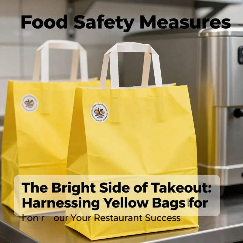
Packaging is the first guardrail against contamination. Cleanliness and integrity must be built into every step of the journey, from the moment a meal is plated to the moment it is handed to a courier. Containers used for takeaway food should be clean, sealed, and sturdy enough to withstand the rigors of street delivery. They need to resist leaks, resist tearing, and maintain their form when exposed to heat and moisture. The idea of a tamper evident seal or a tear strip is not merely a marketing flourish; it is a practical reassurance to the consumer that the food inside remains as the kitchen intended, from the moment it leaves the kitchen to the moment it lands on the customer’s doorstep. In many regulatory environments, tamper evidence is not optional. It is part of the baseline assurance that the food has not been altered or compromised since it was prepared.
Color and packaging design play a surprisingly influential role in safety perception as well. Yellow bags can grab attention on delivery platforms and in busy streets, but they also carry an implicit promise of cleanliness and reliability when paired with disciplined handling practices. A bright color helps staff track shipments, aids in sorting at point-of-sale and during handoffs, and provides a consistent visual cue that supports staff training. The color itself becomes a mnemonic device, reminding workers to keep the contents intact, to avoid cross contact, and to prioritize proper containment. Still, color is not a substitute for procedure. It is a cue that reinforces process, much like a label that flags a hot meal or a cold item for separate handling. When color meets compliance, the result is a packaging system that communicates intention as clearly as it communicates safety.
Temperature control is central to the safety narrative of takeout. Hot items must be kept at or above 60 degrees Celsius, while cold items should stay at or below 4 degrees Celsius. These thresholds are not arbitrary; they align with widely accepted food safety guidelines designed to limit bacterial growth and preserve quality. The practical implication for a yellow bag operation is straightforward to implement but demanding in execution. For hot foods, insulated bags that retain heat are essential, and the containers inside the bag must be sealed and stable. For cold items, insulated bags paired with cooling elements such as ice packs or phase change packs are used to sustain the target temperature through pickup, transit, and last-mile delivery. The delivery frame, therefore, becomes a controlled microenvironment. The bag color remains the face of the brand and a marker for the courier who has to move quickly, but the real safeguard lies in the thermal envelope that protects the meal.
A robust safety system also requires clear regulatory compliance across jurisdictions. Local food safety regulations set the baseline for packaging materials, temperature controls, and labeling. They define what constitutes safe transportation containers, how seals should be implemented, and how long a product can remain in transit before reinspection or disposal becomes necessary. These standards are not static; they adapt to new public health data, evolving supply chains, and changing consumer expectations. The broader picture is one of convergence, where the responsibilities of the kitchen, the packaging designers, and the delivery network align to provide a safe, consistent experience regardless of the customer’s location or the delivery platform they use. In some regions, regulatory bodies even illustrate packaging expectations with examples that extend beyond food itself. The concept of a yellow seal on a bag, or the use of specific color-coded packaging to signify compliance with a particular set of standards, underscores how visibly packaging communicates safety commitments to the consumer while reinforcing the discipline of the operation behind it. In Shanghai and similar jurisdictions, for instance, such seals have become a recognizable feature of a transparent safety culture, signaling to customers that the service takes food safety seriously from the kitchen to the doorstep.
Crossing borders, the compliance conversation broadens. Different countries approach packaging, transport, and food handling with varying regulatory lexicons, yet the underlying principles remain consistent: secure packaging, controlled temperatures, clean vehicles, and clear separation of food from non-food items. Separation is a crucial point. Food must be kept separate from non-food items to minimize cross contamination risks during transport. Delivery vehicles should have designated compartments to avoid the mingling of different products, and crews should adhere to strict cleaning and sanitization schedules between deliveries. The result is a delivery process that upholds the integrity of the food even in the most demanding urban environments. A multi-layered approach—physical barriers inside the vehicle, tamper-evident seals on the bags, and dedicated workflows for hot versus cold items—helps ensure that food safety is not sacrificed for speed.
The packaging system also has to anticipate the realities of the supply chain. Yellow bags are iconic, but they need to be sourced from reliable suppliers who can meet the specialized demands of fast-paced delivery operations. Suppliers must offer materials that are durable under heat, that resist grease penetration, and that can accommodate branding requirements without compromising safety features like seals or liners. Customization options, such as logo printing and color stability, become part of a restaurant’s branding strategy, reinforcing recognition while not interfering with the bag’s safety roles. In practical terms, a restaurant might pair bright yellow bags with internal protective liners to prevent grease leakage and with heat-resistant inserts to maintain temperature. The goal is a coherent system in which the outer bag signals readiness and reliability while the inner components deliver containment and protection.
Another dimension of the safety architecture is the regulation of packaging content and the clarity of information provided with the bag. Labels or markings indicating safe handling instructions, consumer guidance on temperature, and contact information for any consumer concerns are part of a comprehensive safety framework. The consumer is given confidence not just by a bright color but by explicit information that supports informed, safe use of the product. Regulatory bodies may require such information to accompany high-risk items or perishable products, and compliance with these requirements is often an integral part of the restaurant’s licensing and operating standards. In addition to this, the packaging ecosystem encourages providers to maintain rigorous housekeeping practices, including the cleaning and sanitization of vehicles and containers between deliveries. A contaminated or poorly cleaned bag can undermine a whole shift, regardless of how carefully a kitchen prepared the meal. Regular sanitation routines, documented checks, and accountability at the crew level all contribute to closing the loop between pristine kitchen results and a clean, safe handoff to the customer.
The design and operation of yellow takeout bags also intersect with cultural expectations and platform norms. In crowded delivery ecosystems, the visual identity of a yellow bag helps the restaurant stand out among a sea of options on a digital menu and on a doorstep. The public is conditioned to recognize yellow as fresh, energetic, and approachable, which explains why many eateries adopt this color as a marketing cue. But the color’s value extends beyond aesthetics. It acts as a quick cue for safety practices—visible from afar, easy to identify, and inherently legible in dynamic environments such as rain-slick streets or bustling neighborhoods. The color works in concert with practical safety measures to produce a holistic customer experience. The best services align speed with safety: fast delivery, but not at the cost of compromised temperatures, and not at the expense of closed loops in the safety system.
From a sourcing perspective, the choice of yellow takeout bags is often tied to the broader packaging strategy of a restaurant. Vendors offer customizable options, enabling a restaurant to tailor the color and branding while ensuring that the chosen materials meet recognized safety standards. The availability of bulk orders, logo printing, and customization options makes it feasible for a large network of restaurants to coordinate their takeout branding with their safety commitments. The sourcing decision is not merely about appearance; it is about establishing a reliable pairing of materials and processes that supports a consistent safety narrative across all customer touchpoints. In this sense, the yellow bag becomes a symbol of the restaurant’s promise to protect the food and to deliver reliably, which in turn reinforces customer trust and loyalty.
For designers and operators seeking practical redesigns or enhancements, the packaging ecosystem offers options that complement the yellow bag without compromising safety. One example is the emergence of multi-compartment takeout packaging that pairs with color-coded outer bags. Such solutions can improve portion control, reduce cross-contact risks, and facilitate stage-by-stage temperature management within the same order. A single system may include a yellow outer bag for branding, an insulated inner carrier to maintain warmth, and a three-compartment inner box that separates entrées, sides, and sauces. The synergy between these elements reduces the likelihood of spillages and cross-contamination, while enabling the kitchen to maintain high standards of hygiene and presentation. The result is a packaged meal that arrives not only hot and fresh but also organized and easy for the consumer to navigate. To explore options that align with this approach, see the eco-friendly three-compartment takeout packaging option, which offers a practical model for combining safety with branding in a single, scalable solution: eco-friendly three-compartment takeout packaging.
The regulatory conversation, of course, does not end with packaging materials and temperature targets. It extends to the environmental and ethical dimensions of delivery. Compliance increasingly encompasses proper waste management, including the disposal or recycling of packaging materials, proper labeling about recyclability, and clear instructions for end users. This broader view of compliance reinforces the responsibility that restaurants bear for the entire lifecycle of their packaging. It encourages innovations in materials that balance performance with sustainability, and it prompts suppliers to develop offerings that meet both safety and ecological standards. In practice, this means a packaging ecosystem that not only protects food but also minimizes environmental impact, a balance that increasingly defines the reputational and regulatory landscape for restaurants that rely on yellow takeout bags as a core branding element.
The cross-cultural and cross-jurisdictional dimensions of compliance remind us that there is no one global recipe for safety. Local health authorities, transport regulations, and consumer protection laws all shape how yellow bags are used, inspected, and audited. A restaurant might find it straightforward to meet the standards in one city and face new requirements if it scales to additional regions. The beauty of a well-designed packaging strategy is its adaptability. It should be robust enough to withstand the inevitable variability of urban delivery, yet flexible enough to accommodate evolving guidelines and new forms of evaluation. In short, yellow takeout bags symbolize more than a hue; they embody an integrated policy of safety, reliability, and consumer confidence that resonates with customers across neighborhoods and platforms.
The final dimension to consider is consumer education. A well plated, safely packaged meal is only the first half of the story if customers are unclear about how to handle or store it after delivery. Clear handling instructions, temperature guidance, and simple reminders about re-heating or refrigeration can help ensure that safety is maintained in the moments after delivery. The packaging can carry these messages, but it also depends on the broader communication strategy of the restaurant and its delivery partners. The goal is to create a seamless experience where the yellow bag signals immediate safety and the accompanying information provides practical steps for preserving it once in the customer’s hands. In a mature system, these elements work together so that a family meal delivered in a yellow bag arrives not only with warmth but with confidence that every precaution has been observed along the way.
The chapter closes not with a stamp of finality but with an invitation to ongoing attention. Yellow takeout bags have become a recognizable element in the modern food delivery ecosystem, and their success rests on more than color. It rests on the alignment of packaging materials, temperature management, tamper evidence, vehicle sanitation, regulatory compliance, and thoughtful design that respects both the customer and the complex network that brings the meal to their doorstep. As restaurants continue to refine their safety architectures, yellow bags will remain a visible banner accompanying the quiet, essential work of food safety. The best operators treat the color as a reminder—a daily prompt to uphold the standards that keep food safe, fresh, and trustworthy from kitchen to street, to doorstep, and beyond.
External resource: https://www.food.gov.uk/publications/food-safety-for-takeaway-and-delivery-services
Bright Hands, Bold Brand: The Rise of Customizable Yellow Takeout Bags in Modern Food Delivery
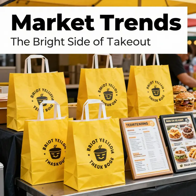
The street outside a busy lunch crowd is a living canvas for color. As riders glide past storefronts and screens glow with menu options, something as simple as a yellow takeout bag can become a pocket-sized billboard. The color is not accidental. It is crafted to catch the eye in a sea of options, to transmit warmth and urgency at the moment a customer chooses a meal, and to linger in memory long after the bag has been set down on a kitchen counter or at a doorstep. In recent years, this combination of visibility and sentiment has elevated yellow takeout bags from mere packaging into a strategic asset for the food industry. The rise of customizable yellow bags reflects a broader shift in how restaurants think about packaging: not as a passive container, but as a brand touchpoint that travels with the food, across platforms, distances, and moments of consumption.
Color psychology offers a plausible lens through which to understand this trend. Yellow is often associated with happiness, optimism, and warmth. In a marketplace crowded with gray, white, and muted tones, a yellow bag announces itself with a clarity that is hard to miss. That visibility has tangible effects in two domains that matter for any food business: branding and operations. On the branding side, yellow bags enable a single, cohesive signal to customers across multiple touchpoints. Whether they glimpse the bag on a busy street, recognize the color in a delivery photo on a smartphone, or associate the hue with a particular restaurant’s identity during a quick pickup, the color helps reinforce recognition. On the operational side, the bright shade helps crew members and customers alike locate and identify bags in crowded spaces, reducing misplacements and improving the efficiency of handoffs between kitchen staff, drivers, and customers. When speed and accuracy are at a premium, a bag that stands out is not a cosmetic choice but a functional one.
The practical rationale for yellow extends beyond aesthetics. In many delivery ecosystems, packaging must perform under pressure: the bag should withstand tem- peratures, moisture, and the occasional spill, while still presenting the food in an appealing way. Durable materials—often kraft paper with protective coatings or moisture-resistant linings—are now paired with thoughtful design features. Some bags are engineered to be self-standing, a small architectural detail that matters at pickup points where staff arrange orders for customers or for display on a counter near the register. This feature not only enhances shelf visibility but also makes the moment of handing over the order more deliberate and organized. In the restaurant world, where the pace of service is a rhythm of minute-by-minute decisions, even such modest design choices can translate into tangible gains in presentation and efficiency.
The case for customization is equally consequential. A yellow bag that carries a logo, a slogan, or a brand color palette functions as a mobile advertisement. The ability to tailor bags in bulk with branding elements enables restaurants to present a consistent visual identity across all delivery channels, storefronts, and takeout counters. Customization goes beyond logos. It can include the choice of bag size, the inclusion of messaging about sustainability, and even the texture or finish of the surface, all of which contribute to a coherent customer experience. When a customer later recalls the meal, the memory is often anchored, not just to the flavor, but to the visual imprint of the packaging. That imprint reinforces loyalty, encouraging repeat orders and word-of-mouth referrals, especially in a crowded landscape where many options look similar at a glance.
Bring this into the context of an ever-expanding delivery ecosystem, and the logic becomes even clearer. The rise of delivery platforms has intensified the need for packaging to perform across a spectrum of environments: kitchens with tight space, riders navigating city streets, and customers opening orders in homes, offices, or dorm rooms. Yellow bags can be especially forgiving in this context. The color stands out in app thumbnails and in street photography, where a single image might determine whether a person chooses one option over another. This is not simply about making something look good; it is about shaping perception at critical moments of choice and post-consumption reminiscence.
A notable undercurrent in this trend is the push toward sustainability. Consumers increasingly expect packaging to align with environmental values. In response, many suppliers have grown more capable of offering recyclable or biodegradable solutions that do not sacrifice the performance needed for hot, greasy, or heavily sauced items. The dialogue between branding and sustainability is nuanced: yellow can be applied to eco-friendly materials in ways that preserve the color’s impact while signaling responsibility. A bag that is both visually distinctive and earth-friendly communicates a message that resonates with modern diners who care about the lifecycle of the packaging they dispose of. For restaurants, that alignment matters in two ways. First, it supports compliance with evolving packaging regulations and waste-management expectations. Second, it can become a talking point for customers who value responsible choices yet still want a strong brand footprint during the logistics journey.
From a sourcing perspective, the market for customizable yellow bags has evolved to accommodate a range of business sizes and budgets. Suppliers now offer bulk orders with options for logo printing, color-matching, and even custom taglines, enabling small and mid-sized operations to achieve a professional, consistent look without prohibitive costs. The process from design to delivery has been streamlined, with faster turnaround times and digital proofing that reduces risk and accelerates go-to-market timelines. This accessibility matters because it allows restaurants to adapt quickly to seasonal campaigns, local promotions, or limited-time menu items that benefit from a distinct packaging identity. A quick, flexible supply chain for packaging is, in effect, a competitive lever that complements culinary creativity and service quality.
The design of the yellow bag itself matters beyond branding. Food safety, moisture management, and thermal protection are essential considerations. Bags that incorporate moisture barriers or heat-resistant linings help keep burgers steaming, noodles firm, and soups intact during transit. In some configurations, the bags feature reinforced handles or gusseted sides to distribute weight more evenly, reducing the risk of tears under heavy orders. When combined with water-repellent finishes or wax-treated papers, these features contribute to a more reliable experience for customers who expect their orders to arrive as promised, every time. The result is a packaging system that does not merely contain food but safeguards its quality from kitchen to couch, desk, or door.
In this broader narrative, the yellow takeout bag becomes a canvas on which a restaurant can express values and promises. It invites customers to infer quality, care, and consistency even before they take the first bite. The color upgrades the delivery moment into a brand encounter. It is not just that the bag is yellow; it is what the yellow bag communicates about the business behind it. A restaurant’s decision to adopt customizable yellow packaging is, at heart, a statement about the role of packaging in delivering an integrated customer experience. It is about how a brand uses every pixel of contact—color, texture, print, and function—to translate culinary craft into perceived value. And as the packaging ecosystem continues to mature, the emphasis on thoughtful design and sustainable materials will likely intensify, further cementing yellow bags as a strategic instrument in menu storytelling and customer retention.
For readers who want to explore practical options and emerging sources for such packaging, the landscape now includes suppliers that offer ready-to-order configurations with high-quality finishes, durable materials, and branding capabilities that can meet tight deadlines. While the specifics of pricing and production timelines vary by region and order size, the trend is clear: accessible customization paired with responsible materials is shaping how a takeout bag can carry both a meal and a brand promise. As restaurants increasingly see packaging as a critical extension of their service, the investment in well-crafted yellow bags becomes not a cost to be minimized but a strategic asset to be optimized. The color, once a visual cue, now anchors a broader strategy for brand presence, customer trust, and sustainable practice in a market where every order is a micro-interaction with the business.
In closing, the rise of customizable yellow takeout bags is best understood as a convergence of three forces: branding efficacy, practical packaging design, and evolving consumer expectations around sustainability. Each order transports more than food; it transports perception. Each box, sleeve, or bag is a touchpoint that can strengthen or erode a customer’s impression of a restaurant. By aligning color, materials, and customization with a clear message about quality and responsibility, restaurants can transform packaging from a transactional detail into a meaningful part of the dining experience. As this chapter has sketched, the yellow bag is not a simple container but a dynamic instrument of brand equity, operational efficiency, and consumer trust in a faster, more visually oriented food economy. For those ready to explore further, one practical avenue is to examine packaging options that balance branding with eco-conscious design, an approach that keeps the yellow bag both vibrant and responsible. eco-friendly takeout packaging options can be a useful starting point for restaurants seeking to align aesthetics with sustainability while maintaining practical performance on crowded streets and over busy delivery routes.
Beyond aesthetics and sustainability, a thriving packaging strategy for yellow bags involves partnerships with suppliers who understand the nuances of the takeout workflow. The ability to customize in bulk, print clear branding, and deliver on tight schedules is essential for keeping campaigns coherent and timely. Restaurants can benefit from a packaging partner who can translate a brand’s color palette into a bag design that remains legible when folded, resistant to smudges from sauces, and easy to tear open without compromising integrity. The interplay between visual identity and tactile experience matters here; customers remember not only the food but the moment of unboxing, the feel of the bag, and the sense that the brand has paid attention to the small details that signal care. In this sense, the yellow bag becomes a stagehand, quietly supporting the performance of dining and delivery rather than competing with it.
As the industry continues to evolve, a few guiding questions can help restaurants navigate this space effectively. How will the bag’s color, material, and finish perform under peak meal-time conditions across multiple climates and transportation modes? Does the chosen packaging align with the restaurant’s broader sustainability commitments, from sourcing to end-of-life disposal? Are there opportunities to use the packaging as a storytelling device—perhaps highlighting local suppliers, seasonal menus, or community initiatives—without overloading the bag with information? And finally, can the packaging scale with marketing calendars and menu experiments, so that a brand’s yellow identity remains coherent across campaigns and channels? Addressing these questions thoughtfully can yield packaging that does more than hold a meal; it reinforces a brand’s promise and strengthens the customer relationship with every delivery.
To close this thread, consider the broader implications for the food industry. The move toward customizable, durable, and eco-conscious yellow bags signals a shift toward packaging as a strategic lever, not a cost center. It reflects how restaurants navigate a competitive environment where first impressions are often formed in seconds, and where a color can travel through screens, streets, and social conversations to become part of a brand’s enduring story. The yellow takeout bag, once a simple wrapper, now carries the weight of branding, sustainability, and customer experience across the continuum of food delivery. In the chapters that follow, we will explore how these packaging decisions interact with broader trends in retail food packaging, including the rise of self-service pickup and the integration of packaging with digital ordering platforms, offering a more complete view of how color and container shape the future of food service.
External resource for broader context on packaging trends and consumer expectations can be found at: https://www.packagingdigest.com/food-packaging-trends-2026
Final thoughts
The utilization of yellow takeout bags in the restaurant and food service industry serves as a powerful tool not only for branding and visibility but also for adhering to food safety standards. As competitive pressures and consumer expectations evolve, adopting these vibrant takeout bags can set your establishment apart while ensuring compliance with regulations. By integrating customizable solutions into your packaging strategy, you can further enhance customer engagement and satisfaction. The choice of packaging may seem small, but it can have a significant impact on your brand and business success.