Clear plastic cups are not just a practical solution; they are also a canvas for creativity and branding. For bubble tea shops, beverage chains, restaurants, food trucks, catering services, event planners, and corporate procurement teams, understanding the design of clear plastic cups can lead to better customer experiences and enhanced brand visibility. In this exploration, we dive into functional considerations, aesthetic features, the impact of customization and branding, sustainability practices, and innovative market trends surrounding clear plastic cups. Each aspect plays a crucial role in how businesses can leverage these products to meet their unique needs while appealing to their target audiences.
Seeing Through Clarity: Functional Design as the Silent Engine of Clear Plastic Cups
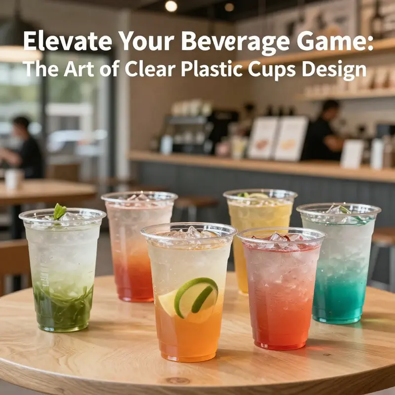
The art of clear plastic cups lies not in flash but in function disguised by transparency. When a consumer lifts a cup, a cascade of judgments already begins—the color of the liquid, the depth of its hue, the way light passes through a beverage, and even the texture that hints at viscosity or effervescence. This is why the core of functional design for clear plastic cups centers on content visibility. In sensory-driven sectors like wine tasting, juice flights, or craft cocktails, the cup becomes a lens through which aroma, flavor, and texture are sampled before the first sip. Clarity, uniformity, and absence of visual contaminants enable evaluators to read a drink with a degree of honesty. The design is less about making the liquid look appealing than about ensuring the observer can read it accurately, so brands and event organizers can rely on color, layer, and clarity as valid signals in a tasting journey. A well-made cup celebrates what is inside without shouting over it, a principle echoed across materials and processes that govern the modern clear cup’s performance.
Material choice anchors this philosophy. Food-grade PET stands at the intersection of clarity, rigidity, and safety. It is chosen for its ability to hold a beverage without imparting color, odor, or taste and for its resilience against small impacts that might occur in transit or at a crowded event. The choice matters because even subtle changes in surface texture or wall thickness can scatter light, dulling the very transparency that makes the cup valuable for sensory evaluation. The practical implication is straightforward: manufacturers must balance clarity with mechanical robustness. The material should resist cracking when cold liquids are poured in and withstand minor bumps during stack-and-ship cycles. It should also remain chemically stable when facing acidic fruit drinks or cocktails with citrus notes. The emphasis on PET or similar food-grade plastics is not merely a matter of compliance; it is a guarantee that the cup remains a faithful stage for the beverage rather than a distraction from it. In this sense, the visible clarity and chemical inertness become inseparable friends in the cup’s functional toolkit.
Beyond the material itself, the geometry of the cup plays a decisive role in whether the design delivers as promised. A uniform rim—neither too thick nor too thin—reduces turbulence during pouring and protects the edge from nicking during handling. A perfectly even lip improves the drinking experience by delivering a smooth, fingertip-free edge that glides along the lips. Ergonomics extend to the cup body, where rounded corners and a comfortable grip texture reduce the chance of slippage. For beverages that demand a longer hold—think iced tea or sparkling drinks—the form may lean toward a taller, slender silhouette that preserves carbonation while maintaining a steady mouthfeel. Conversely, short, sturdy profiles suit thicker drinks like iced coffee or thicker smoothies, offering a reassuring grip and stable base for stacking during service. In all cases, the form must harmonize with the beverage, allowing the drinker to engage with color, aroma, and texture without interference from the vessel itself.
A practical cup must also travel well. The ability to stack efficiently without sticking or warping affects both operational cost and user experience. A tightly controlled wall thickness and smooth interior surface minimize the tendency for cups to cling to one another when stacked or nested, thereby reducing labor in large-scale events. The rim, the area most susceptible to damage, benefits from a design that distributes stress evenly. In addition, a close-fitting lid and a secure seal become a competitive advantage for cups destined for transport or outdoor use. When a lid clamps tightly, the risk of leaks drops dramatically, which in turn bolsters consumer confidence and reduces waste. This protective function often accompanies the lightweight nature of disposable solutions, combining safety with convenience in a way that supports quick, efficient service without compromising the visual and tactile experience.
The ease of cleaning and potential for reuse also shape functional decisions. Transparent plastics that are smooth and non-porous resist the adsorption of oils, dyes, and flavors, making them easier to sanitize. In environments where reusability is encouraged, dishwasher compatibility and resilience to repetitive cleaning cycles become essential. The balance between a surface that looks pristine after several uses and a structure that withstands repeated washing without crazing or clouding is delicate. Here, the cup’s surface finish matters as much as its material composition. A glassy, blemish-free exterior helps ensure long-term clarity; any micro-scratches or matte textures can trap residues or alter light transmission, diminishing the very quality of visibility that the design seeks to preserve. The result is a practical cycle: better cleaning performance supports reuse, which in turn requires materials and finishes that resist scratching and staining while still delivering a bright, clean look every time.
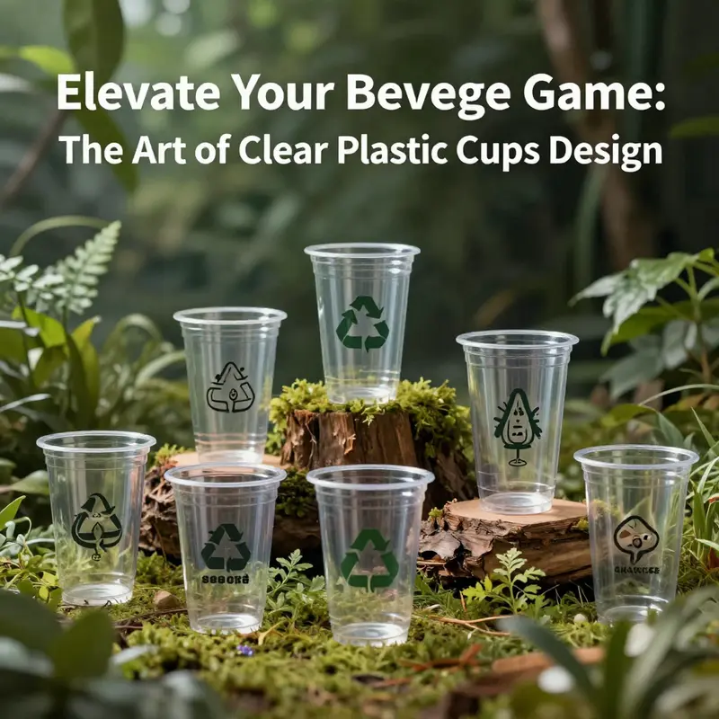
Sustainability is no longer a peripheral concern but a central criterion that informs functional choices. The modern clear cup must reconcile the desire for one-time convenience with the growing demand for recyclability and lower environmental impact. This means materials that are widely recyclable and compatible with existing municipal streams, as well as designs that minimize material usage without sacrificing strength or clarity. A well-conceived cup might also consider incorporations of post-consumer recycled content where feasible, balancing optical clarity with responsible sourcing. The structural optimization that reduces wall thickness in non-critical areas is another route to sustainable performance: less material often means lighter weight for shipping, cheaper production, and lower energy consumption during disposal and processing. Yet even as we push toward lighter, more efficient designs, the emphasis on content visibility remains non-negotiable. The cup must continue to serve as a window into the beverage, ensuring the user’s sensory notations are grounded in actual appearance rather than distorted perception. In this way, sustainability and function converge rather than compete, yielding a cup that performs reliably while supporting broader environmental goals.
Branding and presentation cannot be fully separated from function, though they operate in the background. The clear cup’s transparency provides a neutral canvas for logos, labels, or printed motifs, turning a simple vessel into a manifest of identity. For marketers and event planners, this is not just about decoration; it is about how a cup communicates a story. When a cup carries a brand mark, the mark must be legible yet not interfere with the beverage’s visual cues. This balance can be achieved through subtle embossing, restrained color accents inside the cup, or light-textured finishes that catch the eye without clouding the liquid’s appearance. Decorative cone cups illustrate how finishing touches—embellishment, color accents, or thematic artwork—can elevate a cup from utilitarian to memorable. Even when the design serves pure practicality, there is room for a quiet, deliberate aesthetics that reinforces brand identity in a way that complements the beverage experience rather than overpowering it. A well-designed cup thus becomes a mobile ambassador, aligning function with storytelling across a spectrum of occasions—from casual gatherings to high-end tastings.
The importance of standardization emerges as a practical thread through all these considerations. A consistent rim thickness, uniform interior diameter, and predictable sealing interfaces ensure compatibility with lids, sleeves, and supplemental accessories. This predictability reduces production risk and simplifies logistics for venues that rely on bulk orders and uniform serviceware. It also supports sustainability goals by enabling efficient stacking, compact packaging, and streamlined replacement. The cup’s design thus serves as a platform for broader systems—presentation, service flow, and waste management—where every millimeter of tolerance influences performance. When these factors align, the result is a clear cup that respects the beverage’s integrity, supports the server’s efficiency, and satisfies the guest’s expectations for clarity, comfort, and confidence. For those who study and design these vessels, the lesson is not just about making a transparent container; it is about engineering a reliable, responsive, and responsible window through which every drink can be understood before it is tasted.
To illustrate how these design philosophies translate into real-world choices, consider a scenario in which a dessert-focused caterer features clear cups for a multi-layered treat. The cups are chosen not only for their transparency but also for their ability to showcase multiple textures and colors in a single gulp. In this context, the sequence of layers becomes part of the tasting narrative, and the cup’s capacity must be just right to protect structure while offering a clean, inviting edge for delightful bites. For more on how clear cups can elevate dessert presentation, see the following example: 【clear-cake-cups-transparent-cupcake-muffin-packaging-dessert-slice-container-for-weddings-birthdays-parties-bakery-dessert-bowl-for-fruit-pastries】(https://ecocupbowl.com/product/clear-cake-cups-transparent-cupcake-muffin-packaging-dessert-slice-container-for-weddings-birthdays-parties-bakery-dessert-bowl-for-fruit-pastries/).
Finally, the chapter arrives at a practical reckoning: every performance goal—visibility, safety, ergonomics, cleanliness, sustainability, branding—must be considered not in isolation but as a network of interdependent decisions. The most effective clear plastic cup emerges when designers harmonize these elements into a coherent whole. Clarity is not merely a visual feature; it is a functional proposition about how a beverage feels, how it is perceived, and how easily it can be served, transported, and maintained across a full cycle of use. This integrated approach, grounded in material science, manufacturing precision, and user-centered ergonomics, underpins the continued relevance of the clear plastic cup in a landscape that prizes efficiency, sensory accuracy, and responsible design. For researchers and designers alike, the challenge remains to push the boundaries of what a simple, transparent cup can do—without compromising the very clarity that makes it worth selecting in the first place.
External resources provide a broader context for these design decisions. For a deeper dive into the science of the materials that power these cups and their safety in contact with foods and beverages, see the external reference: https://www.sciencedirect.com/topics/materials-science/polyethylene-terephthalate
Seeing Through Style: The Aesthetic Language of Clear Plastic Cup Design
Clear plastic cups live at a quiet crossroads where visibility meets function. They are not flashy vessels; they are designed to disappear, letting light, color, and texture do the talking. The most obvious feature begins with transparency. High clarity isn’t just a visual cue; it is a design philosophy. When a liquid slides into the cup, its hue, depth, and even the movement of ice become part of the experience. This unobstructed view supports sensory evaluation and branding alike. In contexts such as wine, cocktails, or craft beverages, the cup becomes a transparent stage where color stratification, carbonation, and texture are read at a glance. The clarity also exerts a subtle influence on perception: a drink that looks vivid and clean in a clear cup often feels more precise and refreshing to the tasters and guests. The cup’s appearance, therefore, is inseparable from the drink’s story, and the designer’s aim is to minimize distraction while maximizing the drink’s inherent appeal.
Beyond transparency, the minimalist design language of clear plastic cups reinforces modern atmospheres without competing with the setting. The absence of color and ornament creates a versatile stage that can blend into casual gatherings, upscale tastings, or everyday moments at home. A clean silhouette—straight walls, uniform rim, and balanced proportions—reads as calm, organized, and confident. This restraint matters; it ensures that the cup complements rather than competes with the beverage, lighting, or tableware. In many settings, the elegance of a simple, well-made cup is in its quiet confidence. It signals efficiency and care, inviting guests to focus on the drink’s content rather than on the vessel itself.
Texture and tactility are the next layer of aesthetic thought. Even with the most transparent material, the sensation of the rim, the smoothness of the interior surface, and the lightness of the weight contribute to a premium perception. A uniform, polished edge elevates the experience by reducing hesitation during pours and enabling a confident lift from glass to mouth. The surfaces—crystal-clear on the inside and outside—catch light in familiar ways, altering perception as the drink moves. The result is a cup that feels precise in the hand, with a subtle, almost imperceptible grip that signals quality without shouting. Designers often balance rigidity and warmth by controlling wall thickness and rim geometry. A cup that is too thin might feel fragile; one that is overly thick risks looking bulky. The right balance communicates reliability and care, essential traits in a design language that must still be adaptable to a wide range of beverages and contexts.
Customizability is where aesthetic strategy meets commercial necessity. The transparent surface behaves like a blank canvas, inviting brands to imprint identity through printing, labeling, or artwork that remains legible and vibrant against the liquid backdrop. In hospitality settings, branded cups become mobile advertising that travels with customers from a bar to a lounge to a banquet hall. The clarity of the cup ensures logos, slogans, or thematic motifs are read clearly, maintaining the drink’s integrity while multiplying brand touchpoints. Customization can extend to color accents, frosted or matte finishes, and embossed or debossed textures that add a tactile layer to the visual impression. Yet even with these enhancements, the core value remains intact: the cup presents a stage for the beverage, not a distraction from it. In bakery or dessert contexts, the same clarity is leveraged to showcase treats as well. In bakery contexts, the same clarity that makes pastries appealing also makes packaging like clear cake cups a natural extension. clear cake cups.
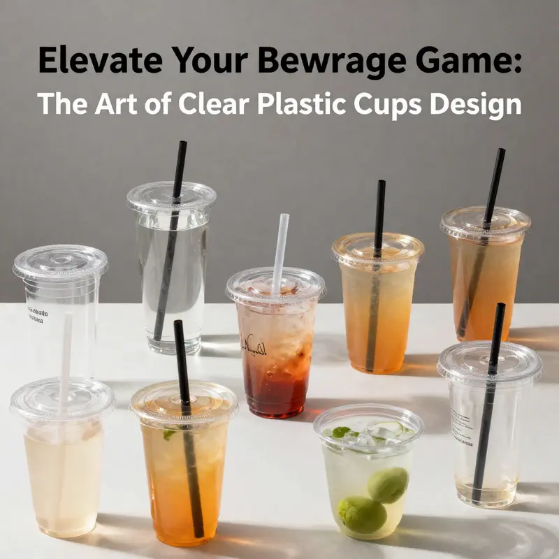
Innovation in lid design adds a subtle but important layer to the aesthetic dialogue. Dome lids, vented lids, and snug seals maintain the cup’s transparent aesthetic while introducing new visual and functional details. A dome lid can add a sense of openness, creating a vertical rhythm above the drink that mirrors the cup’s own tall or short proportions. Venting can reduce misting and improve aroma release, making the cup feel technically refined as well as visually clean. The lid’s interface often features raised patterns, logo imprints, or discreet textures that echo the cup’s lines without fragmenting the simplicity of the overall look. These elements work together to elevate perception: the cup becomes a complete, coherent package where the lid is not an afterthought but an integral part of the design language. The cohesion between cup and lid communicates a thoughtful approach to usability, safety, and presentation, which is essential for professional tastings, event settings, and consumer-facing packaging alike.
The dialogue between aesthetics and practicality underpins every choice a designer makes for clear plastic cups. This is especially evident in how the cups balance ease of use with durability. Lightweight and unbreakable materials are valued not only for safety, particularly around children or outdoor events, but also for their contribution to an uninterrupted visual narrative. A cup that feels flimsy or shifts under a rush of pours can interrupt the sensory experience and undermine confidence in the beverage itself. The design thus leans toward a calm, predictable performance: a rim that sits evenly, a body that stacks neatly for transport, and walls that resist clouding after repeated cycles of washing or low-temperature exposure. Materials such as PET or polypropylene provide the foundation for this balance, delivering stiffness and clarity while maintaining resilience under cold conditions. The result is a vessel that holds its shape under the demands of service, still inviting the eye to linger on the drink rather than the vessel.
Sustainability, too, threads through the aesthetic conversation, shaping how a cup is perceived and chosen in the marketplace. Many clear plastic cups are designed to be dishwasher safe and easy to recycle, features that add to their perceived value by aligning with practical life cycles. Bulk packaging and efficient manufacturing reduce waste and cost, reinforcing the idea that beauty and responsibility can coexist. The design language thus conveys a forward-looking mindset: clarity serves not only the drink but also the user’s broader experience, from storage to cleanup. The choice of material matters as well; PET and polypropylene are selected for their clarity, rigidity, and performance at low temperatures, without sacrificing the sleek surface that defines the contemporary look. In this way, aesthetic decisions do not exist in isolation; they are part of a holistic approach that considers performance, sustainability, and brand storytelling in equal measure.
To close this reflective loop, the design of clear plastic cups is not a single decision but a symphony of choices—transparency, minimalism, edge quality, customization, lid integration, ergonomics, and durability all playing in harmony. The outcome is a vessel that feels almost invisible while making a strong visual statement about cleanliness, precision, and modernity. It invites the beverage to assert its color and texture and invites brands to narrate their identity in a subtle, elegant voice. In the chapters that follow, we will see how these aesthetic foundations interact with culture, event design, and consumer perception, shaping how people experience drinking in a world where the cup itself is part of the performance. External references and further visuals can illuminate these relationships, offering concrete examples of how translucent form can be tuned to different contexts and narratives.
External reading: https://www.benjaminross.com/inside-clear-plastic-cups-with-lid-material-composition-key-features-and-industrial-benefits/
Seeing the Brand in Every Sip: Customization and Branding on Clear Plastic Cups
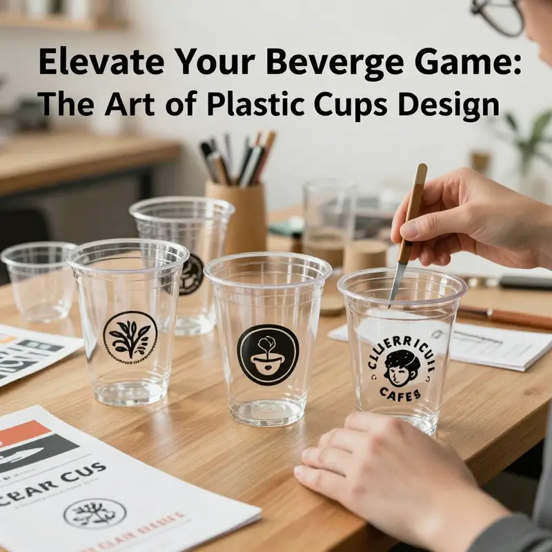
Transparency is the most honest design choice a cup can make. It is not merely a optical property; it is a narrative channel. When a beverage is served in a clear plastic cup, the liquid itself becomes part of the branding story. The hue of the drink, its shimmer, the presence of ice, fruit, or crema—all of these sensory cues are visible to the consumer before any label is read. In this context, customization and branding on clear plastic cups shift from decorative add-ons to strategic assets. They translate brand values into tangible, portable touchpoints that travel with the consumer from the event table to the social feed and beyond. The cup becomes a moving billboard that still respects the primary purpose of the container: to hold, protect, and present the drink in the best possible light. This evolution mirrors a broader shift in the relationship between packaging and experience. Brands no longer rely on a single logo on a sleeve or a cardboard carrier; they design a visual ecosystem where the cup itself carries identity, tone, and even a promise about what lies inside.
The core opportunity here is contrast. A clear vessel frames color, clarity, and texture, and a well-executed branding treatment capitalizes on that openness. Bold, high-contrast logos can emerge from the glassy surface with minimal interference, while more restrained treatments—subtle embossing, delicate foil accents, or a soft matte finish—offer tactile cues that reinforce quality without shouting. The advantage is not just visibility; it is credibility. Consumers perceive beverages that arrive in well-branded, thoughtfully finished cups as higher in quality and care. The transparency invites trust: if the container is clean, stylish, and well made, the drink inside earns a share of that same credibility.
Printing on clear cups has matured into a fine balance of clarity, color fidelity, and durability. The most common methods—screen printing, digital printing, and laser etching—each offer distinct aesthetics and practical tradeoffs. Screen printing excels at bold, durable logo marks with solid color blocks. It can cover a broad surface area, which is valuable for wraparound branding or elongated messages. Digital printing, by contrast, shines with photographic imagery and complex color gradients. It is ideal for campaigns that require frequent refreshes or highly detailed artwork. Laser etching introduces a tactile nuance—shimmering, subtle engravings that have an almost premium, jewelry-like quality. When used on clear plastic, laser etching creates contrast without relying on pigment, which can be advantageous for environmental and food-safety considerations. The choice among these techniques is rarely about a single feature; it is about the entire sensory package—how color, texture, and legibility coexist on a curved, translucent surface.
As brands explore these techniques, they also navigate the geometry of the cup itself. Clear cups are not perfectly flat canvases; they curve toward the rim, taper at the base, and may vary in diameter along their height. Designers must anticipate distortion, particularly for wraparound graphics. Proofing steps become essential to ensure legibility and impact from any viewing angle. When a brand identity is expressed through typography, for example, letterforms must breathe. A bold wordmark may fill a wide band around the cup, but the same art can overwhelm the surface if it wraps incorrectly. Conversely, a minimalist icon paired with a clean wordmark benefits from generous negative space and precise alignment to maintain legibility as the cup is held, tilted, or stacked. In practice, this approach translates into careful parameter work during the design phase: safe zones for critical elements, tested scale relationships, and proofs that account for real-world handling scenarios—pouring, passing, stacking, and re-use in some cases.
The communicative power of these cups is amplified when customization extends beyond logos. Personalization can include QR codes that connect to digital menus or loyalty programs, reminding guests that the brand lives both on the table and online. A QR code can be discreet or prominent, depending on the campaign objective. It can drive experiential content, such as a micro-story about a beverage’s origin, a limited-time promotion, or a sustainability pledge that aligns with consumer values. Pairing a QR code with a sustainability message is particularly resonant in today’s market, where many consumers seek brands that demonstrate environmental responsibility. The code also creates a bridge between physical packaging and digital storytelling, turning a disposable object into a conduit for ongoing engagement.
In parallel with personalization, brands are increasingly using clear cups as part of a broader identity system. Color guidance, typography, and iconography are calibrated to be consistent across all touchpoints—cups, napkins, signage, and digital channels. The effect is a cohesive atmosphere: a space that feels curated rather than incidental. The impact extends beyond aesthetics. A well-aligned system reduces cognitive load for customers, who can instantly recognize a brand through familiar shapes, colors, and typefaces. It also reduces the need for extra labeling on the cup itself, as the visual language carries part of the story. In some cases, embossing or debossing is employed to introduce a tactile layer of branding without increasing ink coverage. A raised logo, for instance, can catch light differently as the drink moves, offering a subtle dynamic that complements the perceived quality of the beverage.
The strategic value of customization is not limited to brand recognition. It also serves as a memory cue that enhances event recall and social sharing. At weddings, corporate gatherings, or festivals, customized cups act as keepsakes that extend the life of the experience. A unique color story or a personalized graphic can transform a practical item into a memento, increasing the likelihood that attendees share photos and tag the event or brand online. In turn, these shares become organic marketing, creating impressions well beyond the initial encounter with the cup. The social dimension of cup branding is reinforced when the design acknowledges the beverage’s nature while maintaining a consistent brand voice. A coffee service, a fruit-forward mocktail, or a crafted tea can all benefit from design details that reflect texture, aroma, and flavor expectations in a purely visual way.
From a product-management perspective, the practicalities of customization must align with safety and sustainability. Cups are typically made from materials such as PET or polypropylene, chosen for their rigidity, clarity, and performance at low temperatures. The design must ensure that inks and finishes comply with food-safety standards and that print durability withstands common handling, light dishwasher exposure where applicable, and the occasional rough surface contact. This is not just about aesthetics; it is about preserving brand integrity in real-world use. Durable prints resist fading, peeling, or smudging, maintaining legibility of messages, logos, or QR codes after multiple uses or wash cycles. When customization includes printed sustainability slogans or recycling instructions, durability also protects the integrity of the communication. An incomplete or misleading message can undermine the brand’s credibility more quickly than a faded logo can, so reliability is essential.
The practical guidance for implementing this branding approach rests on a few disciplined steps. Start with a clear brief that defines core brand elements—color palette, typography, and iconography—then translate them into a scalable cup design. Collaborate with suppliers who offer robust proofing processes, including color proofs, dimensional proofs, and sample runs that mimic end-use conditions. Ensure print durability through material-appropriate inks and protective coatings that are food-safe and compatible with the chosen printing method. Plan for accessibility by reinforcing legibility in high-contrast combinations and providing readable sizing for essential information such as product names or ingredients when required by regulation. And always evaluate cost versus impact. The incremental cost of high-quality printing is often justified by the extended brand exposure and the enhanced consumer perception of value.
The concept of a branded cup can be illustrated by considering a practical application in decorative and functional display. A set of clear cake cups designed for desserts and events showcases how branding can be both visible and tasteful. The design logic prioritizes clarity of the dessert’s appearance while using the cup as a canvas for a restrained, elegant identity. The result is a cohesive presentation where the edible item, the container, and the branding reinforce each other. For a closer look at how such clear presentation is executed in practice, see this example of clear cake cups for desserts and events. clear cake cups for desserts and events. This reference demonstrates how a thoughtful approach to surface area, color, and typography can elevate a simple dessert into a memorable brand moment. At the same time, it shows how the same principles scale to other beverage vessels, from iced teas to sparkling waters, where the cup remains the primary stage for the brand narrative.
Beyond the immediate aesthetic and functional considerations, there is a broader industry context that supports the ongoing shift toward branded clear cups. Customization is increasingly seen as a core component of experiential marketing. It enables brands to create immersive moments, where every element of the service experience, down to the vessel, communicates a story about quality, care, and connection. The cup is no longer an anonymous vessel but a carrier of brand promise. As consumer expectations continue to rise, the ability to deliver consistent, delightful experiences through packaging becomes a differentiator that adds tangible value to the drink. In this sense, customization on clear cups is less about decoration and more about design thinking—the deliberate alignment of visual language, material choices, and interaction with the user to create a seamless, resonant experience from sip to memory.
External reference: for a broader industry perspective on the intersection of customization, sustainability, and packaging aesthetics in insulated and printed drinkware, see this source: https://www.merchlist.com/custom-insulated-cups-with-printable-straws/
Clarity with a Conscience: Redesigning Sustainable Pathways in Clear Plastic Cup Design
Clear plastic cups have long stood as a paradox of modern convenience: they deliver instant sensory transparency while inviting questions about the environmental costs of mass consumption. The chapter that follows this exploration of design choices culminates in a simple, urgent question: how can a cup that makes a beverage look its best also respect the planet that bears the cost of its creation, use, and end of life? The answer lies not in one miracle material or a single clever feature, but in a holistic reconsideration of form, function, and responsibility that threads through every stage of the cup’s life cycle. As designers and manufacturers embrace sustainability as a core criterion, the very act of shaping a clear cup becomes a dialogue among clarity, durability, weight, and recyclability. This conversation happens not in a vacuum but within a broader system of policy, consumer expectations, and evolving production technologies that increasingly reward efficiency without compromising user experience.\n\nAt the heart of sustainable clear plastic cup design is a material shift. Historically, many disposable cups relied on petroleum-based polymers that offered crisp clarity and stiffness but carried a heavier carbon footprint. Today, plant-based polymers such as polylactic acid (PLA) are gaining attention as credible alternatives. PLA is derived from renewable resources like cornstarch or sugarcane, which can reduce life-cycle greenhouse gas emissions compared to conventional plastics. Yet a mature sustainability strategy does not hinge on a single material switch; it integrates multiple levers to optimize environmental performance across the product’s entire life cycle. For instance, thinner walls can achieve the same perceived sturdiness with less polymer while maintaining transparency and rigidity sufficient for typical beverages. This wall-thin concept, when executed with advanced molding and quality control, lowers material usage without compromising the cup’s function. It also reduces the energy required in materials processing and transportation, since lighter shipments translate into fewer fossil fuel emissions per unit delivered.\n\nThe idea of lighter, more efficient cups naturally leads to questions about durability. A cup must withstand chilling, warming, pouring, and handling without cracking or warping. In the sustainability equation, durability and recyclability are not enemies but partners. A cup that lasts longer in use but remains easy to recycle at the end of life can reduce overall waste. Engineers achieve this balance through optimized wall geometry, uniform rims for stable pouring, and deliberate choices about translucency versus coating. The trend toward minimal coatings is not incidental; it reflects a growing understanding that coatings can hinder recyclability if they break down during the sorting process. Water-based inks for branding, for example, can replace solvent-based finishes, preserving both print legibility and the cup’s recyclability. When producers communicate clear guidance on disposal and recycling, consumers can make informed choices that align with environmental goals rather than inadvertently undermining them through improper disposal. For branding and marketing, the same clarity that makes the beverage look appealing becomes a platform for responsible messaging—an important consideration as shoppers increasingly expect sustainability claims to be verifiable.\n\nContainer design also speaks to the practical realities of events, hospitality, and consumer culture, where efficiency, cost, and practicality intersect with ecological concern. Stackability, for instance, is more than a convenience feature; it reduces packing volume, which in turn lowers transportation emissions and storage space requirements. A well-structured cup stack takes up less space in transit and in kitchens, meaning fewer trips to deliver supplies and consequently lower fuel burn. The move toward thinner walls is most effective when paired with precise tolerances that prevent deformation during stacking and loading. In practice, this requires high-precision manufacturing processes and rigorous quality assurance, ensuring that a thinner cup does not fail under typical handling conditions. When executed correctly, such innovations lead to real gains in efficiency at scale, which is where sustainability begins to translate from theory into measurable impact.\n\nBeyond materials and geometry, the end-of-life pathway for clear plastic cups deserves equal attention. Recycling remains a linchpin of modern sustainability, but it hinges on the ability to collect, sort, and reprocess the cups into high-value feedstocks. The simplest recyclability story—“made of a single material” and “no problematic inks”—is not always sufficient in practice. Education and infrastructure are required so that households, businesses, and events know how to dispose of cups properly and how to separate them from other waste streams when necessary. In some markets, this means dedicated recycling streams for PET or PLA cups, along with clear labeling that helps users distinguish which material family their cup belongs to. The broader industry response includes designing for compatibility with existing recycling streams, avoiding coatings and additives that contaminate recyclability, and pursuing standardization in labeling to reduce confusion at the point of disposal. When these systems come together, the once-conflicted goals of clarity and recyclability begin to reinforce each other, making it easier for consumers to participate in sustainable practices without sacrificing the user experience.\n\nBranding and communication are not merely aesthetic considerations in sustainable cup design; they are practical tools that help close the loop between production and responsible disposal. Water-based inks, minimal coatings, and robust adhesion protocols ensure that logos and artwork remain legible during the product’s use while not hindering the cup’s recyclability after use. The design narrative—what the cup looks like, how it feels, and what it communicates about environmental values—can become a cue for responsible behavior. A cup that looks recyclable and is designed to be recycled can help shift consumer habits toward better waste sorting. For designers and marketers, the challenge is to balance visual appeal with ecological integrity, so that the cup functions as a persuasive, informative artifact rather than a disposable afterthought.\n\nPractical considerations also extend to the supply chain and the broader logistics of sustainability. Transportation efficiency, for instance, is enhanced by lighter, thinner cups that maintain performance. Reduced packaging material further lessens material usage and waste, while optimized palletization lowers the energy costs of storage and movement. In parallel, manufacturing footprints are trimmed through process improvements, such as more efficient extrusion and thermoforming methods, which cut energy consumption and waste generation. These improvements do not occur in isolation; they are part of a larger system in which suppliers, manufacturers, and customers collaborate to minimize environmental impact while keeping the clear cup a dependable, versatile tool for any beverage service. This collaborative ethos is increasingly reflected in industry-wide standards and emissions reporting, as stakeholders seek measurable progress rather than aspirational targets.\n\nThe consumer dimension is equally essential. People want products that are visually appealing and that align with their values. They appreciate clear, credible information about how a product was made and what happens to it after use. Transparent design choices—such as showing a product’s renewable content, recyclability, and potential for compostability where applicable—help build trust. In practice, this means packaging and labeling that are informative without being misleading. It also means recognizing that sustainability is not a binary condition but a continuum. A cup made partly from renewable materials, designed for recyclability, and optimized for lower transport emissions is a meaningful step forward, especially when paired with responsible consumer behavior. In turn, consumer demand shapes the market by rewarding investments in better design and more responsible production, creating a virtuous circle that pushes the industry toward ever-greener solutions.\n\nTo illustrate how these ideas translate into real-world practice, consider the ongoing dialogue between material science, design engineering, and policy frameworks. Regulatory developments are pushing the industry to reduce single-use plastic waste and to adopt clearer labeling, better recycling practices, and stronger end-of-life stewardship. While regulations vary across regions, the overarching trajectory is consistent: sustainability is no longer optional but integral to competitive design. This shift encourages designers to consider the entire lifecycle from the outset and to test innovations against practical constraints, from the efficiency of production lines to the realities of post-use collection. In this environment, the clear plastic cup becomes a testbed for how we can reconcile visibility, usability, and environmental responsibility in a single, coherent object.\n\nA broader reading of innovation suggests that sustainable design is not a rejection of the cup’s defining attributes but a thoughtful reimagining of how those attributes are deployed. Clarity remains essential for sensory evaluation and consumer enjoyment. The challenge is to preserve that clarity while ensuring the cup’s production, use, and disposal align with ecological priorities. In this sense, the modern clear plastic cup is not a dead end but an evolving platform. It invites experimentation with materials, geometry, surface finishing, and labeling strategies that together create a product that is both delightful to use and considerate of the environment. The path forward involves continuous learning, rigorous testing, and transparent communication across stakeholders, from raw-material suppliers to waste-management facilities and, finally, to the end users who hold the cup in their hands.\n\nFor readers seeking a broader context on how the plastics industry is innovating toward sustainability, a comprehensive industry resource highlights ongoing research and policy developments aimed at reducing environmental impacts while maintaining performance and consumer value. This perspective reinforces that sustainable design is anchored in both scientific advancement and practical implementation. It also reminds designers and manufacturers that the journey toward greener cups is collective, iterative, and deeply connected to the systems that enable production, distribution, and recovery. Industry observers often point to measurable milestones—reductions in material use, improvements in recyclability, and more efficient logistics—as signs that the shift is real and scalable. The integration of such milestones into product development plans helps ensure that ecological considerations are embedded in every decision, from material selection to print finishes to packaging and end-of-life strategies. The result is a clear cup that remains a trusted vehicle for beverages while also serving as a thoughtful statement of environmental stewardship.\n\nIn closing, the sustainability of clear plastic cup design is not a singular tweak but a layered, integrated discipline. It invites designers to balance clarity, performance, and ecological responsibility, to leverage advances in renewable materials and processing, and to embrace smarter packaging and end-of-life pathways. It requires collaboration across the value chain and a willingness to rethink conventional assumptions about disposability and waste. When done well, sustainable design does not diminish the user experience; it enhances it by providing a transparent conduit for values as well as beverages. The cup becomes an everyday artifact that demonstrates that convenience and responsibility can coexist, and it sets a higher standard for how we think about objects we often take for granted. The evolution of clear plastic cups thus offers a compelling blueprint for design that respects both human enjoyment and planetary health.\n\nInternal resource: disposable-clear-plastic-cup-outdoor-picnic-pet-cup-drinking-cup-for-parties-birthdays-weddings-camping-utensils\n\nExternal reference for further context on sustainable disposable cups: https://www.plasticseurope.org/en/news-and-press/press-releases/2024/09/18/plastics-innovation-for-sustainable-disposable-cups
Seeing Through Progress: Market Trends and Innovations Shaping Clear Plastic Cups Design
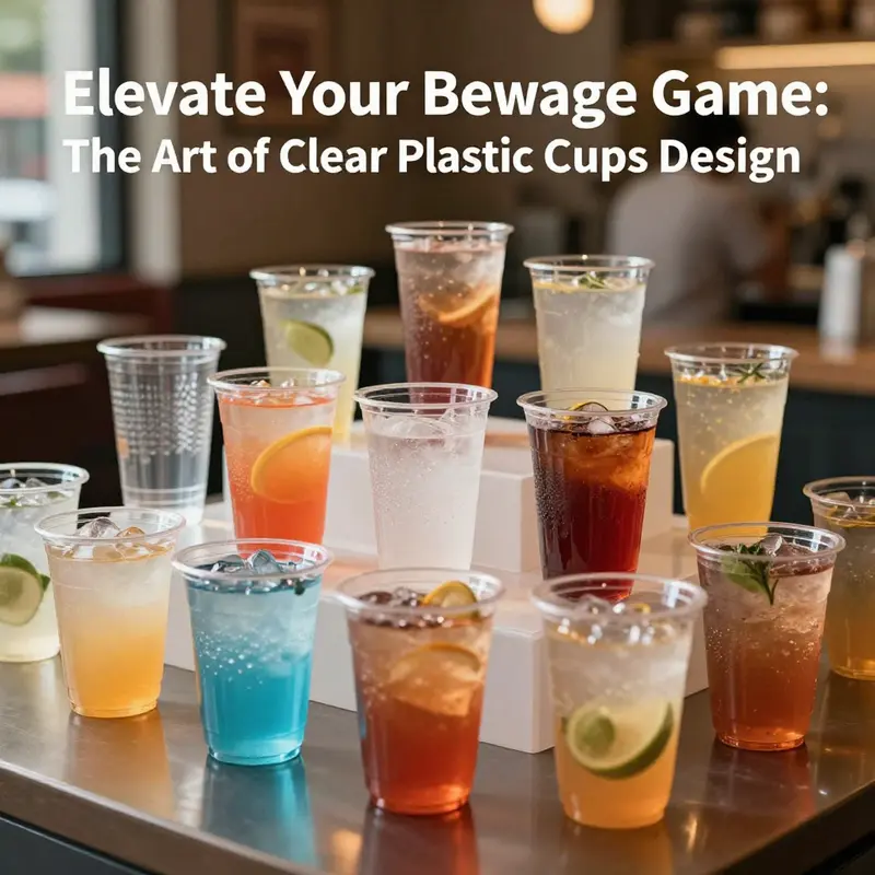
Clear plastic cups have evolved from simple disposables into design protagonists that blend transparency with tactile appeal, making them a focal point for sensory experiences at scale. The color, clarity, and texture of a beverage are not just visual cues; they become critical data points for judges in tastings, for guests in casual gatherings, and for brands seeking a narrative that blends utility with aesthetic promise. In this light, the current chapter tracks how market momentum, material science, and design ingenuity converge to redefine what a clear cup can symbolize. The ongoing demand across food service, hospitality, and beverage sectors is not only about holding a drink; it is about presenting that drink in a way that communicates quality, freshness, and care. Market data from early 2026 points to a steady ascent, with a global outlook that places the category on a growth path influenced by versatility, reliability, and the power of visual appeal. A compound annual growth rate of about 5.5 percent from 2026 through 2033 underscores how widely these cups are adopted—from upscale tasting rooms to outdoor festivals, from quick-service restaurants to corporate events. This expansion is driven not only by volume but by a shift in expectations: buyers want cups that perform in real-world settings and also carry branding and storytelling potential. The ability to showcase drink color and layering remains a decisive advantage, particularly for cocktails, mocktails, and premium beverages where presentation matters as much as taste. In other words, the modern clear cup is becoming a stagecraft element, a portable display that travels easily from bar top to outdoor terrace, while still delivering the reliability needed for high-traffic venues.
Material choices sit at the heart of this evolution. The most widely used polymers—polystyrene (PS) and polyethylene terephthalate (PET)—are prized for their combination of clarity, rigidity, and impact resistance. PET, in particular, offers a crisp, glass-like translucence that holds color without distorting hue, a property that can elevate the perceived freshness of a pale lemonade or the depth of a dark, layered cocktail. PS contributes stiffness and a certain tactile solidity that many servers associate with quality, especially in cold beverage applications. Together, these materials support a spectrum of use cases, from single-use settings that demand cost-efficiency to more robust, reusable scenarios where durability is prized. The design language thus evolves in tandem with material science: manufacturers push for thinner profiles without sacrificing strength, and suppliers deliver clear resins that resist clouding when exposed to ice-cold liquids or brief contact with citrus acids. In this context, practical considerations such as dishwasher compatibility, leak resistance, and temperature tolerance remain integral to the design brief. It is not merely about seeing through a cup; it is about maintaining optical clarity under diverse conditions and ensuring that the container supports the beverage’s integrity as it journeys from vendor to guest.
Beyond the raw materials, the shaping and detailing of clear cups have become serious design conversation starters. A uniform, even rim remains a core feature for stability during pouring, stacking, and transportation, but the silhouette now often embraces ergonomic thinking. Tall, slender forms may be preferred for iced tea or sparkling drinks, while shorter, sturdier profiles align with iced coffee or healthful mocktails. These shapes are not incidental; they are tuned to the way a drink sits in a hand, the way it pours, and the way it interacts with ice and foam. This attention to geometry complements branding efforts, because cup profiles can suggest personality—elegant and restrained, or bold and playful—while still performing essential tasks. In parallel, marking and branding technologies have moved from simple decals to a suite of customization options. Embossing and debossing offer tactile cues that catch light and invite touch. Matte finishes can diffuse reflections for easier viewing of drink color, while glossy surfaces emphasize brightness and clarity. Color accents, abstract patterns, or branded logos can be embedded into the cup body or relief-molded into the rim, turning each vessel into a mobile canvas that reinforces a company’s visual identity. The decorative cone cup segment, with its eye-catching profiles and opportunities for color interplay, stands out as a case study in how form and surface treatment can amplify brand recognition at events and tastings.
The innovations extend into niches that push the boundaries of what a clear cup can do, even when the core function remains drinking. A growing line of collapsible or ultra-thin clear cups demonstrates a focus on portability, convenience, and storage efficiency. These designs are notably suited to travel, pop-up events, and emergency preparedness kits, where space and weight matter as much as usability. While they may not offer the same structural rigidity as molded versions, their reusability, compact form, and fast setup align with contemporary consumer rhythms that favor lightweight, on-the-go solutions. Even as collapsible variants win small but meaningful market segments, the broader sector continues to explore how thin-wall technology can preserve clarity while reducing material usage. In parallel, a wave of sustainability-driven efforts aims to reconcile performance with environmental responsibility. The demand for biodegradable and recyclable alternatives is reshaping the design brief, nudging manufacturers to balance transparency with end-of-life considerations. This is not a trade-off between aesthetics and ethics; rather, it is a synthesis in which novelty, clarity, and resilience coexist with compostability or recyclability goals. Designers may lean into disassembly features, clear labeling of material streams, and packaging options that minimize waste, all without compromising the drink’s visual appeal. The result is a clearer, cleaner message about how products fit into a circular economy, rather than a subtle acknowledgment of waste.
A broader implication of these trends is how clear cups serve as a conduit for brand storytelling. The cup is not just a vessel; it is a miniature stage that communicates values through its presence, texture, and finish. Consumers interpret clarity as a signal of quality management and purity, while the branding layer—whether a logo, color motif, or textured surface—sends a message about personality and intent. In a world where conversations about sustainability are increasingly central, the ability to design a cup that conveys both elegance and responsibility becomes a competitive differentiator. The market’s ongoing interest in bulk packaging and dishwasher-safe variants reflects a practical discipline: customers want reliable, scalable solutions that minimize operational friction in busy environments. The best clear cups strike a balance between transparency and durability, offering color fidelity for a wide range of beverages while resisting the wear that comes with repeated handling, ice, and condensation. This balance is not accidental but the result of iterative optimization across materials, manufacturing methods, and finishing techniques that keep pace with consumer expectations.
For designers and suppliers, the current moment invites a pragmatic yet imaginative approach to product development. Material choices should be evaluated not only on clarity but on how they interact with color, light, and adjacent props in a setting. A cup’s rim, wall thickness, and base can influence perceived quality as much as the beverage inside. When exploring branding opportunities, embossing and debossing offer tactile cues that engage the sense of touch, which, in turn, enhances memory and recognition. Finishes—matte for reduced glare or gloss for heightened glow—can alter mood and perception, influencing how guests perceive the drink and the brand. Even the color palette of logos and prints can be optimized to maximize legibility in different lighting conditions. Such details matter in venues ranging from intimate tastings to crowded outdoor festivals, where quick recognition and consistent impressions contribute to a positive overall experience. The decorative cone cup designs, with their potential for vivid color interplay and layered artwork, illustrate how surface treatment and form can work in harmony to create a distinctive visual signature that travels across events and media platforms.
From a strategic standpoint, the market’s trajectory is as much about supply chain resilience as it is about aesthetics. The demand for versatile, all-purpose cups that can handle a broad spectrum of beverages and environments pushes manufacturers to develop more sophisticated supply chains and scalable production processes. Bulk packaging strategies that reduce waste and lower per-unit costs align with the needs of large-volume operators, while still allowing for customized runs that support brand campaigns and limited-edition events. In this sense, the design brief must anticipate both the daily rhythms of service environments and the sporadic spikes that come with seasonal promotions, festivals, and launches. As technology enables faster prototyping and more precise color matching, design teams can experiment with confidence, quickly translating concept into a tangible, testable product. This iterative loop—design, test, refine—ensures that clear cups evolve in step with evolving consumer tastes, environmental priorities, and business imperatives.
In terms of external knowledge that situates these trends within a larger market context, industry analyses highlight a growing emphasis on sustainability alongside performance and branding flexibility. While the core demand for clarity and reliability remains, buyers increasingly expect compatibility with eco-conscious practices and end-of-life solutions. This dual focus—optical fidelity and environmental responsibility—frames the next phase of development for clear plastic cups. Designers and manufacturers will likely pursue innovations that reduce material usage without compromising strength, expand the repertoire of finishes and textures, and streamline branding options so that every cup can tell a compelling, responsible story. For readers seeking a broader market perspective, this external resource offers a comprehensive view of size, key players, and innovations shaping the future of plastic portion cups: https://www.researchmarkets.com/reports/5987143/plastic-portion-cups-market-size-key-players-innovation-2026-2033.
Within this evolving landscape, one practical takeaway for practitioners is to view the cup as a flexible communication tool. It should not only hold a beverage but also carry a message—about flavor integrity, user safety, and brand values. An internal reference point for event branding demonstrates how a clear cup can support a cohesive aesthetic across moments of consumption and social sharing. For example, a disposable clear plastic cup designed for outdoor events and parties showcases how form, surface, and color come together to enhance the guest experience while maintaining logistical efficiency. You can explore a representative example of this application here: disposable clear plastic cup for outdoor events and parties. This type of reference can help teams translate strategic intentions into tangible, scalable packaging that aligns with both budget constraints and brand storytelling goals. In this way, design is not merely about making cups look good. It is about enabling a calibrated dialogue between beverage, venue, and consumer—one that honors clarity, resilience, and responsibility.
As the market continues to unfold, the future of clear plastic cups design will likely hinge on how well form, function, and purpose are harmonized. The convergence of high optical quality with robust, sustainable materials and targeted branding strategies points toward a more intentional, communicative category. The cups will remain transparent vessels, but they will also become more expressive carriers of a brand’s ethos. In every sip, there will be evidence of how thoughtfully designed containers can elevate the perception of flavor, reinforce trust, and extend a company’s reach across diverse settings. This integrated approach—where aesthetics, practicality, and environmental mindfulness inform each design decision—pages ahead a clear, bright, and responsible path for the future of clear plastic cup design.
Final thoughts
Clear plastic cups are an integral part of the beverage industry, combining functionality, aesthetics, branding potential, and sustainability. For businesses like bubble tea shops, restaurants, food trucks, and catering services, investing in thoughtfully designed clear plastic cups not only enhances customer experience but also boosts brand identity. As trends and innovations continue to evolve, staying ahead with these designs can set your establishment apart from the competition. Consider how these insights can inspire your own use of clear plastic cups, enriching your beverage offerings and appealing to today’s discerning consumers.