In the competitive landscape of food service, presentation is as crucial as taste. Enter clear plastic snack cups, an unsung hero that not only showcases your delectable offerings but also contributes to your brand identity. Their transparency allows colorful snacks, trendy beverages, and gourmet desserts to shine, making them particularly effective for bubble tea shops, restaurants, food trucks, and catering services. In the following chapters, we’ll explore how these cups enhance visual appeal, offer customization opportunities for branding, and adhere to high material standards, establishing them as essential tools in event planning and corporate procurement.
Seeing Through Style: How Clear Plastic Snack Cups Turn Snacks into Visual Narratives
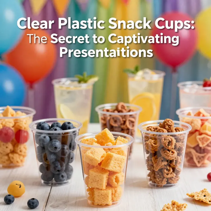
Clear plastic snack cups do more than hold a snack; they stage it. The transparent walls function as a window into the moment of consumption, inviting the eye to linger on the colors, textures, and even the tiny details of a dessert, a fruit bite, or a layered mousse. In contemporary dining settings, where the visual language of food has grown as important as flavor, the clear cup becomes part of the plate, the presentation, and the experience. When light falls on a gelatinous layer or a rainbow of fruit, the cup does not fade into the background. It amplifies what is inside, offering a clean, uncluttered frame that lets content speak with its own authenticity. This is a shift in packaging design from merely containing a product to communicating a story about freshness, hygiene, and care with which the snack has been prepared.
The clarity of the material matters as much as the contour of the vessel. PET and polystyrene, the two most common families used for these cups, share a trait that is pivotal to the consumer’s perception: faultless visibility. PET’s high refractive index and minimal color distortion create an almost glass-like impression in the hand, a quality that conveys purity and reliability. The crisp, transparent surface makes the candy-sugar spark, the mousse’s pale ridges, or the layered hues in a tiramisu-like treat pop with immediacy. When a consumer can see every layer—from the glossy top glaze to the delicate seams between layers—the product is not hidden behind opaque walls; it is presented with an honesty that aligns with contemporary expectations of transparency in food culture. The minimalist aesthetic afforded by the clear cup resonates across demographics, from design-minded young adults seeking Instagram-worthy packaging to parents who prize a hygienic and simple solution for children’s snacks.
Beyond mere visibility, the aesthetic language of clear plastic snack cups is a study in contrasts. Designers exploit the stark contrast between a vibrant snack and a crystalline, colorless vessel to create a display that feels both deliberate and effortless. A bright berry compote, a citrus shard, or a mint leaf can appear almost sculptural when framed by a flawless, transparent rim. Subtle branding elements—such as an embossed logo on the cup body or a barely tinted edge that catches the light—can elevate the cup without obstructing the view of its contents. These touches are not decorative ornamentation; they are conversation starters that allow a brand’s identity to surface through texture and finish rather than loud color or bold typography. The result is packaging that feels premium, clean, and respectful of the consumer’s senses.
The role of the clear cup in branding goes beyond aesthetics. Its very transparency invites trust. In markets where consumers want to see what they are buying, a product that is visible through its container reduces cognitive friction. There is less guesswork about freshness, ingredients, and quality when the vessel itself serves as a window into the food. This is particularly meaningful in events like weddings, banquets, or catered gatherings where guests are choosing between many options at once. A single, well-lit display of clear cups filled with layered desserts or fruit medleys can visually anchor a buffet and guide the eye toward peak offerings. In such environments, the cup becomes a visual cue for cleanliness and care—an embodiment of the service ethos that a host or a brand aims to project.
This visual integrity also intersects with contemporary design trends that favor simplicity and functionality. The clean, uncluttered silhouette of the clear cup aligns with a broader movement toward minimalism in tableware. It serves as a neutral frame that complements, rather than competes with, the snack’s own charisma. For a brand seeking versatility across occasions, a clear cup offers a reliable canvas for customization without losing its core identity. In this sense, the cup is not a static object but a flexible platform. It can host branded labels, colored inserts, or even themed patterns that align with a campaign or a seasonal menu, all while preserving the essential quality of transparency that consumers expect. This adaptability is especially valuable for businesses that operate across multiple channels—retail displays, foodservice, and event catering—where a single packaging concept must perform well under a variety of lighting, shelf conditions, and handling scenarios.
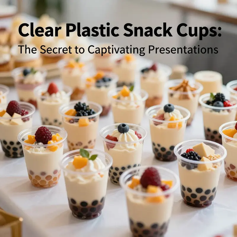
One striking advantage of clear cups is their ability to reveal texture as well as color. A mousse’s creaminess, a mousse’s air pockets, or the delicate granularity of crushed nuts perched atop a surface all gain a tactile dimension when seen through a clear barrier. The sensory cue is intensified because the consumer’s gaze travels directly into the container, encountering the food’s physical presence before it is tasted. This phenomenon enhances perceived quality and desirability. A dessert that looks like it bursts with layers when viewed through a crystal-clear vessel can drive impulse purchases and elevate the perceived value of the entire display. The effect extends beyond desserts. Salads in crisp cups, mini yogurt parfaits with fruit mosaics, or even savory snacks like layered dips can be presented with the same clarity, inviting a viewer to imagine the crunch or the smoothness beneath the surface.
The practical dimensions of the cup influence its aesthetic impact as well. The size, shape, and rim profile contribute to a sense of proportion that can either elevate or undermine the visual balance of a display. A shallow, wide-mouthed cup invites a quick, inviting peek, enabling diners to view the full spectrum of colors at a glance. A taller, cylindrical cup offers a more stately, gallery-like presentation, encouraging a slow, contemplative perusal of the contents. The rim finish—whether a smooth, rounded edge or a slightly squared contour—affects how light interacts with the cup and, consequently, how the snack’s colors are perceived. Even minute design decisions, such as a beveled edge to reduce glare or a subtle curvature to minimize distortion, can affect the overall impression of value and craftsmanship.
The conversation between clarity and branding is ongoing. Clear cups lend themselves to labeled experiences: a product can be accompanied by a branded lid, a colored wrap, or a printed sleeve that communicates flavor, origin, or dietary notes while still preserving the inner view. The viewer is left with a clear understanding of what they are purchasing, free from ambiguity. In this way, clarity acts as a universal language—one that transcends language barriers in global markets and resonates with a diverse audience that values honesty and straightforwardness in food presentation. The visual honesty of the clear cup complements the growing consumer interest in authenticity and simplicity, reinforcing a narrative that emphasizes quality of ingredients, careful preparation, and thoughtful presentation.
The relationship between form and function is central to why clear cups endure in both everyday and celebratory contexts. They carry fluids without leaking, they support a clean, hygienic impression, and they do so with a minimalistic elegance that can be both rustic and refined, depending on the surrounding context. In outdoor events, where lighting is variable and surfaces may be uneven, the cup’s transparency helps the snack to stand out in a sea of disposable ware. It offers a sense of order and calm in an otherwise bustling environment. In indoor settings, the same transparency can catch the eye in a controlled display, where lighting designers and event coordinators work to maximize contrast and highlight the dessert’s most appealing facets. The cup becomes a stage on which the snack performs, rather than a distraction that competes with it.
The aesthetics of clear plastic snack cups are not static; they evolve with material science and consumer expectations. While PET provides exceptional clarity and strength for cold or room-temperature applications, polystyrene offers its own balance of rigidity and cost-effectiveness. Each material presents trade-offs in terms of recyclability, heat resistance, and perception of quality. In responsible packaging design, those trade-offs are weighed against the product’s lifecycle and the event’s sustainability goals. Clear cups that can be reused or recycled easily tend to resonate with eco-conscious buyers who want to minimize waste without compromising display quality. The design conversation, therefore, includes not just how a cup looks but how it can be disposed of responsibly after use, how it aligns with brand sustainability narratives, and how it can be integrated into a circular economy framework without sacrificing the beauty of the display.
The interdependence of aesthetics and accessibility is another important thread in this narrative. Clear cups must be sturdy enough to hold the intended contents, yet light enough to be convenient for single-use settings where guests may handle dozens of cups in a single event. They must resist fogging when cold desserts are transferred from refrigeration to a warm outdoor space and maintain their optical clarity despite exposure to sunlight and ambient heat. Modern manufacturing has advanced these performance characteristics, delivering cups that stay crystal-clear under typical serving conditions while remaining affordable for bulk orders. The result is a packaging option that is not merely a practical choice but a strategic one, capable of delivering a premium look at a sensible price point. In turn, vendors and event planners can design menus and service styles that leverage the cup’s aesthetic to create cohesive, memorable experiences rather than assemble a disparate collection of ordinary disposables.
From a storytelling perspective, the clear cup invites a narrative about the snack itself. The content can broadcast its own color story—the natural greens of lime and mint, the warm amber of caramel, the violet of berry compote—each hue amplified by the transparent shell. This color storytelling is particularly potent in social contexts where visual impact drives sharing. A striking combination of color and texture captured inside a clear vessel can become the focal point of a photograph, fueling social media engagement and word-of-mouth promotion. Brands and event designers who understand this dynamic treat the cup as a visual amplifier rather than a mere container. They select shapes and finishes that enhance, not obscure, the color and texture of the snack, and they coordinate with lighting, backdrop, and color palettes to produce a unified aesthetic. The effect is a dining experience that is as much about looking as it is about tasting—a choreography of sight and flavor that lingers in memory after the last bite is savored.
The conversation about clear cups would be incomplete without acknowledging that the choice of packaging is also a reflection of consumer values. In markets that prize transparency, authenticity, and simplicity, the clear cup aligns with these ideals more closely than opaque alternatives. Shoppers who want to verify ingredients, colors, and textures at a glance will gravitate to products that reveal themselves through the packaging. In this sense, the clear cup is not a neutral vessel but a deliberate choice that communicates a philosophy of openness. The trend toward artisanal, handmade, or bespoke food experiences finds a natural ally in the clear cup, which can showcase the craft behind the dessert, the care in the layering, and the seasonal or local ingredients used. The aesthetic is thus inseparable from the ethics and storytelling of the product, reinforcing trust and an emotional connection with the consumer.
For those seeking to explore this design philosophy in practice, the modest yet powerful example of a clear cake cup offers a useful touchstone. Such cups illustrate how a simple container can elevate a slice of cake or a crowned pastry into a display piece. They demonstrate how a well-chosen lid, a precise rim, and a clean surface can support a cohesive brand story without overpowering the dessert itself. The reference point is not a catalog of features but a way of thinking: packaging as a canvas, where every design decision is a line in a narrative about taste, quality, and presentation. In this light, a clear snack cup becomes more than a disposable item; it becomes a medium through which food, design, and consumer culture converge.
Internal link for further reading on display-focused clear cups: clear cake cups for dessert packaging.
As markets continue to refine the language of packaging aesthetics, clear plastic snack cups will likely evolve in tandem with innovations in coatings, barrier layers, and printability that preserve clarity while enabling more nuanced branding. Yet the core appeal remains constant: the ability to see, judge, and crave what lies inside. The cup becomes a trusted partner in the eater’s journey from curiosity to appetite, guiding perception with a quiet confidence. In the hands of designers and operators who appreciate the power of visibility, the simple spoonful becomes a story, and the story, in turn, becomes a reason to reach for another bite.
External resource for broader industry context: https://www.alibaba.com/showroom/plastic-snack-cup.html
Clear Canvas, Bold Brand: How Customization Elevates Plastic Snack Cups into Brand Storytelling
A clear plastic snack cup is more than a transparent container. When design and branding are woven into its form, it becomes a living piece of the product experience. The transparency that once served only to reveal what lies inside now offers a stage for storytelling, a chance to communicate values, and a promise of quality before a single bite is taken. In this evolving landscape, customization and branding are not supplementary details; they are core aspects of how a snack, a dessert, or a beverage is perceived, remembered, and shared. The shift from utilitarian packaging to purposeful, branded serving ware reflects a deeper consumer expectation: that every surface, even something as ordinary as a disposable cup, can carry meaning. The clear cup, then, stands at the intersection of function and narrative, offering both practicality and a platform for connection with the eater, the event, and the brand. As people increasingly seek experiences they can own and reuse in memory, the cup becomes a portable canvas for identity, emotion, and a sense of occasion. It is not merely about holding a portion; it is about presenting it with intention, with visual clarity, and with a story that travels beyond the moment of consumption.
Customization in this space extends beyond logos on the side or a color splash. It is about choreographing the entire user journey—from first glance to final disposal. The cup can incorporate elements that guide and enhance the user experience, such as a molded grip that fits comfortably in the hand, a lid that seals reliably, or a shape that minimizes spills during a crowded event. These functional details are not afterthoughts; they are integral to the brand promise. When a consumer encounters a cup that feels crafted for the product inside, trust is built at once. The choice of material reinforces that trust. PET is prized for its clarity and strength, PP offers heat resistance, and PLA introduces a compostable option for brands seeking a lower environmental footprint. Each material choice communicates a different value proposition and shapes how the product is perceived on the shelf or in a social media post. The transparency of the cup is a double-edged gift: it invites curiosity about the contents while demanding a consistently high standard of presentation. That expectation nudges manufacturers and designers toward higher levels of control, from the clarity of the resin to the fidelity of the print and the tactile appeal of the finish.
In designing clear cups that carry a brand’s voice, designers must think beyond the surface. Brand identity becomes a language expressed in color, texture, and even geometry. The cup can adopt custom graphics that align with a brand palette, but it can also venture into more nuanced territory: a matte finish to reduce glare, a spot UV coating to create a subtle shimmer, or an embossed pattern that provides a tactile cue of premium quality. Printing techniques matter here. Pad printing can deliver sharp logos on curved surfaces, while flexographic printing can handle wider color expanses for more elaborate artwork. The finishing touches—whether a frosted effect on the interior for a modern, understated look or a gloss that amplifies the content inside—help shape the consumer’s perception of the product. Yet the visual impact must coexist with legibility. Essential information such as ingredients, allergen notices, and storage instructions cannot be sacrificed for aesthetics. In a marketplace saturated with choice, clear communication is a non-negotiable part of good design.
This is where storytelling becomes practical. A cup can carry a visual narrative that extends the product’s origin, flavor profile, or occasion-specific theme. A wedding or party, for example, becomes a celebration not just of food but of shared memories, and the cup can reflect that sentiment through a carefully chosen motif, a distinctive color cue, or a sequence of design elements that unfold with each course. In corporate settings, branded cups serve as portable marketing collateral, turning occasional consumption into touchpoints that reinforce a brand’s character with every sip. The cup becomes a micro-environment where the consumer experiences the brand’s tone—playful, premium, minimalist, or rustic—long before the product is opened. This approach aligns with a broader shift in packaging toward brand storytelling, where packaging is not simply a container but a narrative contributor that can be captured in photos, stories, and unboxing videos. The visual intrigue created by clear cups helps products stand out in a crowded display and invites social sharing, which in turn can amplify brand reach at a lower unit cost than traditional advertising.
The rise of customization in clear cup design also intersects with sustainability and consumer values. Clear cups reveal content, which heightens the perception of freshness and quality. At the same time, producers are responding to the appetite for environmentally conscious packaging. Materials are evaluated not only for clarity and performance but for recyclability and end-of-life considerations. For brands that want to tell a sustainability story, choosing recyclable PET or bio-based alternatives and communicating these choices clearly on the cup can be a meaningful differentiator. Ink systems are evolving as well, with water-based inks offering lower environmental impact and safer handling for food-contact surfaces. While the conversation around sustainability can be complex, the practical takeaway is straightforward: a transparent cup can embody a brand’s responsible posture when its production aligns with safe, sustainable practices and transparent communication about those practices.
The deployment of custom-designed clear cups across different channels—retail, events, catering, and foodservice—illustrates how branding moves through touchpoints. In retail displays, the cup’s transparency becomes a visual hook that showcases the product’s color, texture, and layering. In events, a brand can craft a cohesive look across all disposable tableware, turning a simple snack into a curated experience. In catering and food service, branded cups contribute to a consistent aesthetic that echoes the restaurant or venue’s identity. In each case, brand consistency is reinforced by design decisions that harmonize the cup with lids, sleeves, and complementary packaging. The ability to personalize not only individual orders but also entire thematic sets means brands can tailor experiences for holidays, anniversaries, or seasonal campaigns without sacrificing efficiency or safety. The challenge lies in balancing artistry with practicality; the cup must be affordable at scale, safe for food contact, and compatible with automated filling and sealing lines. Achieving this balance requires a careful dialogue among designers, material scientists, packaging engineers, and marketers who understand the end-to-end consumer journey.
The practical strategies for achieving this balance start with a clear brief that translates brand values into physical attributes. Designers map out how a brand’s personality translates into shape, color, texture, and typography that can be seen and felt on the cup. They consider whether a curved silhouette communicates approachability or whether a sleek, angular form signals modernity. They decide on finishes that minimize fingerprints for a clean display or accent textures that invite touch in a retail environment. They choose print methods that preserve color fidelity on curved surfaces and ensure that the chosen material yields a crisp, transparent presentation. They also design with logistics in mind: consistent return-on-investment calculations, production tolerances, and compatibility with lids, seals, and heat exposure. The result is a cohesive package that aligns with the brand’s broader packaging strategy, whether that strategy prioritizes premium perception, playful accessibility, or sustainable stewardship.
In this continuum, the clear cup becomes part of a larger ecosystem of packaging design. It can be paired with a windowed cake box or a transparent dessert cup that communicates a shared aesthetic across a product line, reinforcing brand recognition at multiple points of contact. The idea is to create a visual language that travels from the display case to the table and into the social feed. For designers and brands, this means acknowledging the power of visibility. The contents must look as good as the promise on the surface, and what the cup reveals should be the product’s best self. It also means recognizing the social nature of contemporary consumption. People photograph bright, clear presentations and share them widely; the cup becomes a vehicle for social storytelling. The more the design speaks to a consumer’s values—quality, authenticity, sustainability, or whimsy—the more compelling the cup becomes as a brand ambassador. The opportunity lies in approaching customization as a strategic asset rather than a one-off order, building long-term relationships with suppliers who can support scalable, repeatable, design-driven production while maintaining strict food-safety standards.
To illustrate the connective tissue between clear cup design and broader packaging strategy, consider how the same principles apply when packaging is designed to showcase contents through a window. A well-conceived window design invites curiosity and sets expectations about what is inside, much as a well-branded clear cup can. This alignment between different formats helps ensure a consistent consumer experience across the brand’s packaging suite. A related example in the packaging world shows how clear, windowed containers for desserts or snacks convey freshness and quality while allowing the product’s artistry—layered mousse, vivid fruit, or delicate pastry—to take center stage. The underlying lesson is not merely about aesthetics; it is about building trust through transparency and consistency. The consumer is given an unobstructed view of the product’s actual appearance, which reduces guesswork and enhances satisfaction. When brands extend that clarity to every touchpoint—from the cup to the box to the napkin design—the overall experience becomes coherent and memorable. The viewer perceives a calculated, deliberate approach rather than an assortment of isolated design decisions, which strengthens perceived value and reinforces loyalty over time.
For practitioners seeking practical paths forward, the design process should begin with a rigorous assessment of how customization can support business goals. This means defining target segments, clarifying brand voice, and outlining the specific moments where the cup will serve as a brand touchpoint. It means choosing materials and printing methods that preserve clarity while enabling durable color and legibility. It means considering the user experience—ease of opening, secure lid performance, and comfortable handling—so the cup feels as reliable as it looks. And it means planning for sustainability and compliance, ensuring that every custom element has a purpose and that the final product aligns with safety standards and labeling requirements. The chapter of customization is not a standalone act; it is a continuous conversation among brand, design, and production teams, a dialogue that respects the product inside while elevating the vessel that carries it. When executed thoughtfully, clear cups become more than packaging: they become a narrative device that amplifies brand personality, enhances consumer delight, and supports a sustainable, scalable packaging strategy.
Convergence of design and delivery matters too. The most successful branded clear cups are those that integrate seamlessly with lids, sleeves, and secondary packaging. They are designed for mass production without compromising the unique identity the brand wishes to communicate. The manufacturing team must ensure that color fidelity and clarity hold under the rigors of high-speed filling and sterilization processes. The marketing team, in turn, must translate the brand story into a design language that remains legible from a distance, resonant in a photograph, and adaptable across product lines and seasonal campaigns. When all parties align, the consumer experience is smooth from first impression to disposal. A well-considered compliance approach—clear labeling of ingredients, allergen information, and safe handling instructions—further strengthens trust and supports retailers who require precise packaging disclosures. The result is a packaging solution that fulfills functional demands while delivering on the promise of brand storytelling, a promise that engages, delights, and endures in the memories of those who choose the product again and again.
As brands continue to explore personalization through clear plastic snack cups, they gain a powerful advantage: the ability to tailor experiences without compromising efficiency. The cup becomes a personal invitation to participate in a moment—whether it’s a wedding celebration or a casual snack on a sunny afternoon. The design language travels with the product, across shelves, events, and social media, creating a consistent narrative that audiences can recognize instantly. In this way, customization transcends decoration. It becomes a strategic framework that guides decisions about materials, printing, shape, and usability, all while honoring the product’s appeal and ensuring it remains safe, recyclable, and scalable for the needs of modern commerce. The future of plastic snack cup design lies in this integrated approach—where clarity, color, texture, and form converge with brand storytelling to create packaging that is as meaningful as the product it contains. That is the essence of the move toward branded, customizable clear cups: a simple thing that, when crafted with intention, helps brands connect more deeply with consumers and invites them to participate in a shared experience with every open, enjoy, and dispose. For organizations ready to invest in this approach, the payoff is not only a more compelling display but also a stronger, more resilient relationship with customers who appreciate design that respects both people and planet.
picnic kraft paper cake boxes with clear windows. In practice, this concept translates into a cascade of decisions that begin with the presentation and end with the impression. The cup, in its own right, acts as a micro-stage where color, texture, and typography perform together to convey a brand’s personality in a moment of anticipation. The user holds the cup, inspects the product, and, in doing so, experiences a narrative built around clarity and care. The design must be legible yet expressive, simple yet distinctive. It must make the content inside look irresistible while honoring the consumer’s desire for a responsible, well-made product. This balance is not accidental; it is a deliberate outcome of a design process that treats packaging as a living extension of the product. It is this seriousness about presentation and performance that will continue to drive growth in a market where consumer preferences favor personalization and brands seek to cultivate loyalty through meaningful, tangible interaction with their packaging.
For those seeking further context on how regulatory and safety considerations intersect with packaging aesthetics, industry guidelines emphasize that clarity and readability are essential. Text should remain legible under typical lighting conditions, colors should not misrepresent the product, and all labeling should be conspicuous and compliant with applicable food-contact regulations. The goal is not to obscure information behind art but to present it with the same care that goes into color matching and branding. In other words, the triple aim of customization—distinctive identity, enhanced user experience, and compliance—must be pursued in parallel rather than as separate tasks. When this triad is achieved, the result is a clear cup that does more than hold food; it communicates reliability, creativity, and a shared sense of value that resonates with consumers across occasions and markets.
To close the arc of this chapter without reducing it to a single lesson, consider the consumer as a co-creator of the brand story. A clear plastic snack cup invites interaction, whether through the moment of discovery on a shelf, the social moment of photographing the product, or the everyday ritual of enjoying a favorite snack. Personalization can be as simple as a name or a date for a special event or as expansive as a seasonal theme that spans the entire line. The design must be robust enough to endure repeated use or disposal, yet refined enough to feel special at the moment of purchase. The best outcomes come from partnerships among brands, suppliers, designers, and retailers who share a commitment to quality, clarity, and responsible packaging. In this shared effort, the clear cup becomes a symbol of how modern packaging can honor aesthetics and function, tell a story, and invite participation while remaining grounded in safety, sustainability, and scalability. The next chapter will delve into how these design principles translate into practical production strategies, the trade-offs brands face when choosing materials, and how to measure the impact of customization on sales, loyalty, and environmental footprint. And as the market evolves, the clear cup will continue to serve not just as a vessel but as a trusted messenger for the brand’s promises, a small but mighty ambassador that travels from display to table and into the daily narratives of consumers.
External resource for further reading: https://www.fda.gov/food
Clear by Design: Materials, Standards, and the Visual Promise of Plastic Snack Cups

The appeal of a clear plastic snack cup goes beyond its ability to hold a snack. It is a small theater of transparency where the color, texture, and arrangement of the contents perform a silent, persuasive show. In a world of disposable tableware, the choice of material becomes the final act that determines safety, performance, and environmental impact. When a consumer peers into a transparent cup, what they see is not just a snack but a promise: the product inside is visible, accessible, and ready to be enjoyed. This visibility is a deliberate design feature that has shaped how brands communicate quality, freshness, and care. The chapter that follows traces how the materials behind that clarity—primarily PP, PS, and PLA—are chosen for different needs, how global standards govern their use with food, and how lids, seals, and branding options integrate into a coherent packaging strategy that is at once practical and persuasive.
At the heart of every clear plastic snack cup is a balance among clarity, strength, and safety. Polypropylene (PP) earns its place as a workhorse in both reusable and disposable containers. Its strength is its resistance to warping and cracking, even when the vessel is bumped or lightly dropped. PP maintains structural integrity under normal serving conditions, which makes it a reliable choice for cups that will hold dry snacks like seeds, nuts, or trail mixes. The material is widely recognized for food-grade safety, a credential that transcends regional markets and supports a global supply chain. Consumers expect that a disposable cup can carry flavor and aroma without contributing unwanted substances; PP’s chemical profile is well aligned with that expectation, particularly for cold or room-temperature applications where contact with a broad range of snack textures is common.
Yet clarity is a different kind of requirement. In many display-focused contexts—the wedding banquet, the park picnic, the idealized dessert bar—consumers want to see the contents clearly. Polystyrene (PS) excels here because it can deliver a near-crystal transparency that rivals glass. The visual appeal of PS is one of its strongest selling points; a tray or cup that looks pristine and transparent helps snacks, nuts, or dried fruit read as premium and fresh. In practice, PS cups are often chosen when a high level of visibility is essential and when the product’s aesthetic—color, layering, or texture—needs to be showcased with minimal distraction. The trade-off, however, is a vulnerability to UV exposure: over time, UV light can embrittle PS, and prolonged sun exposure can reduce its mechanical resilience. For retailers and caterers who use PS cups in outdoor events, this is less a flaw and more a scheduling detail: shade, shade cloths, or timely turnover to prevent prolonged sunlight exposure helps sustain performance.
A different narrative emerges with PLA (polylactic acid), the bio-based newcomer that aligns with sustainability narratives increasingly prized by brands and consumers alike. PLA is derived from renewable resources like corn starch, and it is designed to be compostable and biodegradable under appropriate industrial conditions. In many settings, PLA cups enable a lower environmental footprint, turning visibility into a story about responsible packaging. Yet PLA’s heat resistance is notably lower than that of PP or PS, so hot beverages or hot-fill processes are typically outside PLA’s comfort zone. For cold desserts, fruit compotes, or chilled mousses, PLA can enable a clear, compostable option that resonates with a growing segment of eco-minded buyers. The material’s end-of-life profile also prompts different disposal pathways. Where PS or PP recycling streams have become familiar in many markets, PLA requires careful segregation to ensure proper composting or industrial processing, avoiding contamination that could undermine recycling programs. These material distinctions—clarity, durability, and end-of-life options—are not abstract considerations. They translate directly into brand choice, supplier negotiations, and logistics planning.
Every clear cup, whether PP, PS, or PLA, enters a regulatory ecosystem built to safeguard public health. The most widely recognized benchmarks are food-contact material standards that govern what substances may migrate into food, how materials are tested, and what labeling or certification is required. In the United States, the Food and Drug Administration (FDA) sets thresholds and testing protocols that determine whether packaging materials can claim food-grade status and be marketed for direct contact with edible products. In Europe, the EFSA framework provides parallel governance, with specifications that can influence the permitted additives, processing conditions, and migration limits. Other regions maintain analogous standards; what matters across borders is a shared emphasis on safety, hygiene, and consistency. Certifications such as ISO 22000—an international standard for food safety management systems—signal that a manufacturer has integrated risk controls, traceability, and prevention measures into the production process. When brands insist on reliable performance, they are not merely choosing a plastic cup; they are selecting a packaging system that has earned credible endorsement from multiple regulatory bodies.
In practice, clear plastic snack cups are often paired with lids designed to optimize freshness and minimize spills. Twist-on or screw-on lids create an airtight seal that can preserve crumbly or dry contents and keep powders from escaping during transport. The lid design complements the chosen material, reinforcing a dependable barrier against moisture, air, and mechanical shocks that could compromise product quality. In addition to the functional benefits, lids also support branding and consumer convenience. The option to print branding on the lid or to include a branded lid can amplify a brand’s identity while maintaining a simple one-use format that appeals to event planners, catering teams, and retail outlets alike. The interplay between cup material and lid design is not superficial; it defines the user experience, from how easily a consumer opens the container to how well the contents appear after a brief shake or after being carried in a crowd.
These material choices carry implications beyond aesthetics and safety. They influence the practicalities of manufacturing, distribution, and end-of-life management. For manufacturers, PP’s durability translates into a forgiving processing window during thermoforming and molding, with reduced risk of warping under typical filling rates. PS requires careful handling to preserve clarity, particularly when exposed to UV or heat that could accelerate material degradation. PLA, meanwhile, introduces a different production calculus: the need for industrial composting ecosystems, specialized waste streams, and consumer education about disposal pathways. Each material’s profile informs decisions on whether a given cup will be used for a seasonal display, a long-form catering event, or a steady daily service in a take-away setting. The result is not a single universal solution but a spectrum of options that align with specific use cases, budgets, and sustainability goals.
The sourcing landscape for clear snack cups reflects this diversity. On global marketplaces, manufacturers offer a range of sizes, configurations, and branding capabilities. Many suppliers provide customization options, enabling brands to imprint logos or labels on the cups or lids and to tailor packaging to fit specific merchandising needs. Printing methods, such as flexo printing, allow branding without sacrificing clarity or integrity of the cup’s surface. Volume thresholds—often expressed as MOQs—and lead times frame procurement considerations, especially for events that require precise inventory planning. When a buyer weighs these options, they are balancing brand visibility with production efficiency and environmental responsibility. The choice of material and the configuration of the lid become a decision about rhythm and reliability in the service equation: will the cup travel unobtrusively through a crowded reception line, or will it sit on a dessert table as a clear stage for color and texture to shine? In either case, the aim remains the same: to deliver a product that looks pristine while performing consistently under real-world conditions.
There is also a strategic dimension to keeping cups and lids compatible across a brand’s packaging family. The symmetry of materials and closures reduces variability in supply chains, which in turn minimizes the risk of stockouts during peak demand. Brands that rely on clear cups for visual merchandising, for instance, recognize that uniformity in appearance—uniform transparency, uniform lid fit, and uniform labeling—helps create a cohesive customer experience. A customer who sees a clean, consistent display is more likely to trust the quality of what’s inside. The converse—dull or mismatched presentation—can undermine perceived value even when the snack inside is excellent. Therefore, design vocabulary matters: the decision to use a crystal-clear PS cup for high-visibility displays, or a compostable PLA cup for a sustainability-forward theme, becomes part of the storytelling around the product and the event. The cups, lids, and branding are not decorative afterthoughts; they are integral to how the product is perceived and how effectively it travels from kitchen to table to the consumer’s hands.
From a materials science perspective, the transparency that consumers expect comes with a set of processing considerations. The resin’s optical properties—clarity, haze, and resistance to yellowing—are influenced by the polymer’s crystallinity, additives, and processing parameters. In PS cups, maintaining optical clarity requires control over resin quality and exposure conditions. Light-induced aging can gradually dull the surface, affecting how vivid the displayed contents appear. In PP cups, clarity has historically been more challenging to maintain due to its semi-crystalline nature, but advances in polymer chemistry and refining techniques have yielded high-clarity variants that retain toughness. PLA’s clarity is competitive and its surface can appear glass-like under the right conditions, yet its sensitivity to heat means processing windows and end-use scenarios must be carefully planned to avoid deformation or dulling. These material behaviors are not abstract concerns for engineers; they directly influence product presentation, customer perception, and the likelihood that a display will persuade a passerby to choose one snack over another.
As the chapter on materials and standards comes full circle, it becomes clear that the clear plastic snack cup is a canvas upon which safety, sustainability, and sensory appeal interlock. The packaging ecosystem recognizes that the cup’s clarity is an asset, but its true value emerges when that clarity is paired with predictable safety and responsible end-of-life outcomes. The ongoing dialogue between manufacturers, retailers, regulators, and consumers continues to refine what counts as acceptable migration limits, what constitutes safe contact conditions, and how brand narratives can be communicated without compromising environmental commitments. The industry’s trajectory—to move toward materials that combine high clarity with strong safety records and adaptable end-of-life solutions—reflects a broader shift in packaging: the fusion of transparency with responsibility, aesthetics with ethics, and market needs with planetary stewardship.
As readers navigate the implications of these materials and standards, they may also consider the broader landscape of available packaging options and how these choices align with event-driven, retail, and home-use scenarios. A practical takeaway is the importance of aligning material selection with the specific culinary and display context. For a dessert bar that emphasizes layered presentation, a cup that showcases the interior clearly can amplify the perceived quality of the dessert. For a snack station where spoons or forks are distributed at the table, an airtight cup can maintain freshness without spillage and reinforce a tidy table setting. For a takeaway service that values compostability, PLA should be evaluated alongside local composting capabilities. In all cases, the broader message is that material science and regulatory awareness are not arcane concerns reserved for engineers; they are essential elements in shaping consumer experience, brand reputation, and sustainability outcomes.
To illustrate how these concepts translate into practice, consider the broader implications for design and procurement. The surface-level appeal of a crystal-clear cup must be matched with assurances about safety and performance. Buyers should seek clear compatibility between the cup material and the intended filling temperature range, the duration of display, and the transport conditions. They should confirm that the lid’s seal integrity aligns with the product’s moisture content and transport dynamics. They should also consider whether the end-of-life pathway supports the brand’s sustainability commitments and how disposal instructions are communicated to consumers. In this way, the material choice becomes part of a holistic packaging strategy—one that honors safety, respects environmental considerations, and preserves the visual storytelling that clear cups are uniquely positioned to offer.
For readers seeking practical direction that ties directly to sourcing and display design, a simple principle applies: select materials with an eye toward the product’s real-world journey. If the goal is maximum color and texture visibility for cold snacks, PS may be the best option, provided the product’s exposure to light is minimized. If the aim is a sustainability-forward display with easily understood disposal, PLA should be evaluated alongside local composting capabilities. If cost-efficiency and durability for frequent use are paramount, PP can deliver, especially in contexts where the cups are reloaded or reused in controlled environments. The lid choice should reflect not only the contents’ stability but also the event or retail context: simple, label-friendly closures for quick turnover; or robust screw-on designs for higher-risk transport situations. In all cases, the packaging must communicate, protect, and perform—while never compromising the consumer’s trust in safety and quality.
The storytelling around clear plastic snack cups is not just about visibility; it is about trust, responsibility, and efficiency across the supply chain. The material’s optical clarity is the first impression, but the safety record, the end-of-life options, and the labeling clarity complete the narrative. When a brand can tell a transparent story—about what the cup is made of, how it protects the contents, how it aligns with recycling or composting streams, and how it remains visually pristine under normal use—that story becomes a competitive differentiator. The consumer honors such transparency with purchase decisions, and the operator recognizes the potential for reduced waste, clearer branding, and a smoother logistical pathway. In that sense, the clear snack cup is a microcosm of modern packaging: a small, rational, well-considered system that blends science, policy, design, and user experience into a product that serves both practical needs and aspirational values.
For those who would like a practical entry point into the sourcing and specification process, a familiar benchmark is the availability of a clear, dessert-ready cup with a secure lid that travels well and presents the product in its best light. Importantly, the path from material selection to consumer satisfaction is not a single leap but a sequence of informed, incremental decisions—each affecting performance, cost, and environmental impact. The right choice depends on whether the priority is visual impact, durability, or sustainability, and on the broader goals of the operation, whether catering for a high-end event, serving daily customers, or supporting a brand narrative around eco-conscious packaging. As markets evolve and technology advances, these cups will continue to adapt—sharpening their transparency, improving their safety credentials, and offering ever smarter disposal options that keep pace with consumer expectations and industry standards.
External reference for further technical context: https://www.alibaba.com/product-detail/130ml-clear-plastic-tiramisu-cup-with1600785948825.html?src=product-search&spm=a2700.galleryofferlist.pisrc.1.5b3f3c9dCZuKxj&searchText=130ml+clear+plastic+tiramisu+cup+with+lid
Final thoughts
Clear plastic snack cups are more than just functional items; they are a significant part of your branding and presentation strategies. Their aesthetic appeal, options for customization, and high-quality materials make them a wise investment for businesses looking to impress and engage customers. By incorporating these cups into your offerings, you create an inviting and professional dining experience that sets you apart from competitors. Remember, the right presentation can make all the difference in attracting and retaining customers.