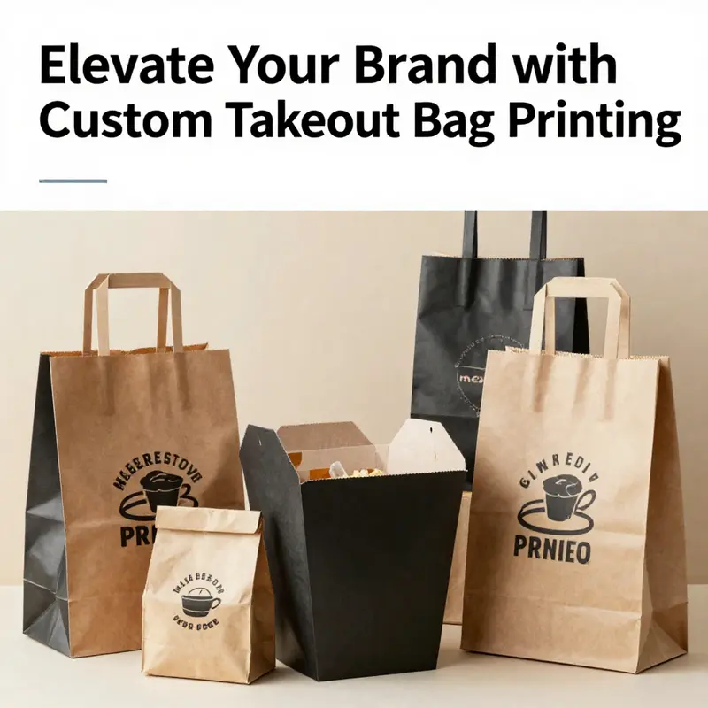
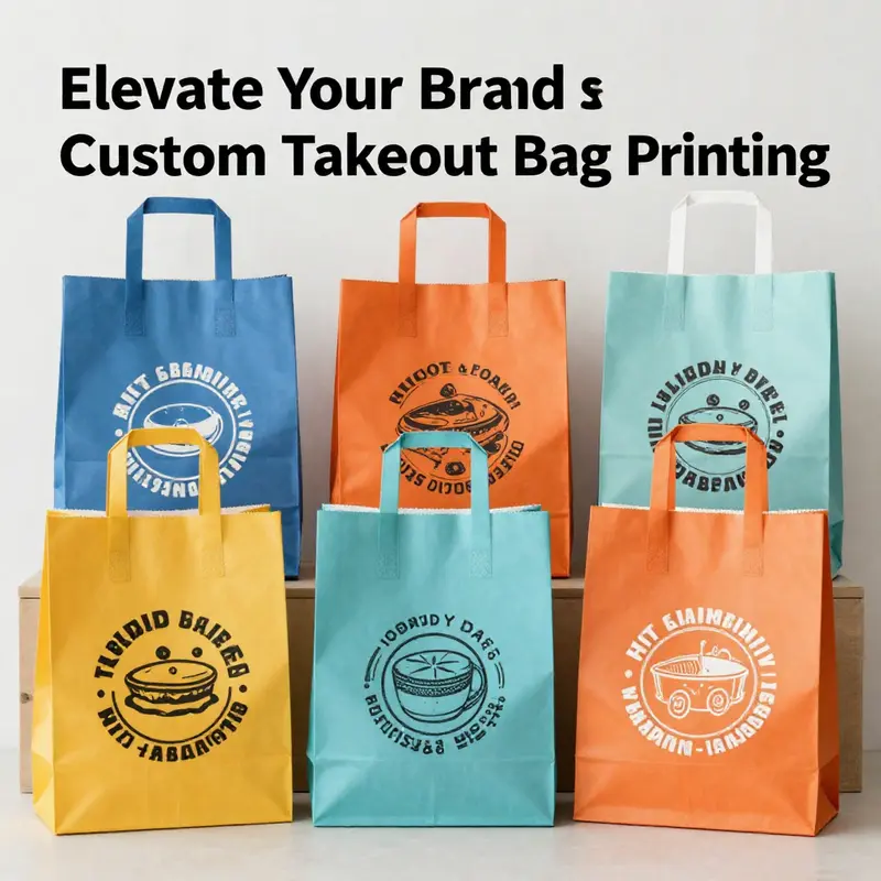
In the dynamic marketplace of food services, effective branding has become essential to stand out. Custom printed takeout bags provide a unique opportunity for businesses like bubble tea shops, restaurants, food trucks, and event planners to reinforce their brand and attract repeat customers. This guide explores the various printing options available, the importance of design for brand awareness, material compatibility for different printing techniques, and effective marketing strategies that leverage takeout bags as a powerful promotional tool. By understanding these elements, businesses can make informed decisions that enhance their visibility and strengthen customer connections.
Brand in the Bag: Elevating Takeout Printing Through Customization and Craft
Every takeout order carries more than a meal; it delivers a first impression, a tangible reminder of a brand’s voice, values, and promise. The takeout bag has become a moving canvas that travels with the customer from the counter to the street and into homes and offices. When restaurants invest in bag printing, they are weaving a narrative that can boost recall, reinforce trust, and encourage repeat visits.
Flexographic printing stands out for its capacity to handle high volumes with speed and cost efficiency. It is a proven workhorse for takeout bags across materials, from traditional paper to biodegradable films. In a single run, flexo presses can deliver vibrant designs that remain legible even after grease or steam. The method excels at repeatable patterns and can accommodate artwork that translates to a rotating printing plate system. The cost-per-unit advantage in bulk orders supports branding across large batches.
Hot stamping offers a premium feel with metallic sheen and tactile contrast. It works well for accents such as a logo seal or borders that benefit from durability against smudging and heat. While hot stamping can be more costly per unit, it is well suited for small runs or limited editions. A combination of flexographic printing for the main design and hot stamping for highlights can deliver broad visibility with a premium cue.
Digital printing can complement the two traditional methods for personalization or short runs. Variable data such as city codes, branch identifiers, or QR codes enable quick concept testing while keeping branding consistent. The triad of options—flexographic for bulk, hot stamping for accents, and digital for customization—creates a practical spectrum that adapts to scale and marketing needs.
Design choices should anchor legibility and recognition. Bold graphics should be legible from a distance, with strong color contrasts to cut through grease and steam. Consider the bag material and how it interacts with ink or foil. A practical approach uses a strong central logo, a clear brand name, and a limited color palette that remains consistent across bag sizes and product lines.
Environment and procurement considerations are also central. Ink longevity, moisture resistance, and end-of-life disposal should align with sustainability claims without sacrificing performance. Paper-based substrates and biodegradable films require inks that adhere well and stay legible under moisture exposure. A cohesive design language across bags, boxes, and wrappers can streamline operations and reinforce brand identity across channels.
In sum, bag printing is a balance of method, design, and strategy that supports brand impact and operational efficiency. As brands experiment with textures and finishes, bag printing will continue to evolve with consumer expectations and sustainability considerations. The bag becomes a portable brand ambassador that travels with the customer and invites loyalty and shareability across social channels.
Printed to Move: Designing Takeout Bags that Turn Every Customer Bag into a Brand Ambassador
Takeout bags do more than carry meals; they carry a story. In a landscape crowded with signage, menus, and digital ads, a well-printed bag becomes a portable canvas, a moving billboard that travels with your customer. When designed with intent, every crumple of a corner and every crease along the bag’s fold becomes a reminder of the brand’s promise. The design language you choose—logo, color, typography, and even the quiet cues of sustainability—doesn’t just communicate who you are. It invites people to engage, remember, and return. In this chapter we look at how print choices translate into brand perception, how materials interact with ink, and how a single print run can become a disciplined, long-term marketing asset. It is not about pretty packaging alone; it is about packaging that respects the customer, supports the product, and extends your reach beyond the storefront without sounding like a loud, interruptive ad.
To start, the method of printing plays a central role in how your bag looks and how well it lasts. Flexographic or ink-printing is a common choice for larger orders because it scales efficiently and delivers crisp lines and solid color across many units. Hot stamping, by contrast, offers a tactile, premium feel with metallic accents or a subtle deboss that can differentiate a brand in a crowded takeout counter. Each method has its trade-offs. Ink printing can handle full color palettes with precise gradients, but may require careful layer management to maintain legibility when grease or moisture is present. Hot stamping provides a clean, standout finish but can limit the level of detail and color complexity. The decision is rarely about which looks better in a static mockup; it is about which method will hold up under real-world usage, where a bag is carried through a doorway, tucked beneath a chair at a lunch rush, or shuffled into a car trunk on a rainy day.
Material compatibility is the next crucial factor. The bag’s substrate—whether it’s paper, a biodegradable plastic, or a compostable film—must respond predictably to the printing process. Ink adhesion is not just about gloss or color depth; it is about how the ink behaves under heat, grease, and moisture. A glossy finish can make colors pop, but it may be less forgiving when the bag comes into contact with hot food or fatty sauces. A matte finish can suppress glare, aiding readability, yet may require a tougher coating to resist smudges. For paper bags, a barrier coating or lamination may be needed to prevent ink from bleeding and to keep the bag from soaking through during a busy dinner service. For plastic or film bags, resin-based inks and heat-curing processes can enhance durability, but the environmental profile of the material and the ink should be aligned with the brand’s sustainability stance. As a result, printing is not a one-off event but a careful negotiation among substrate, ink chemistry, and finish.
Design choices matter more than most operators realize because design is memory, not merely decoration. A strong logo, a consistent color palette, and bold, legible typography work together to create instant recognition. The most important design rule is clarity: if someone cannot identify your brand in a glance, the bag has failed its primary job. Color carries emotion and memory; it can evoke trust, energy, warmth, or tradition. A consistent color system across all collateral—bags, napkins, boxes, and digital channels—helps reinforce the same mental image each time a customer encounters the brand. A tagline or a signature pattern, even if it is subtle, can become a quiet cue that people associate with quality and care. The bag also travels public spaces. It is not just a tool for carrying food; it becomes a footer of the dining experience in transit. A clean, cohesive design invites curiosity, and curiosity invites engagement. Consumers are more likely to recall a brand when the design is distinctive but not chaotic. Too many competing elements reduce recall; a single, strong mark paired with a restrained palette often wins brand moments over brief, forgettable impressions.
This is where customization and branding play their strongest roles. A printed takeout bag is a physical extension of a brand’s personality. It can carry a unique pattern that becomes an identifier, or it may echo a signature tagline that frames every meal with a story of hospitality. The practice of embedding eco-friendly messaging can resonate with a growing segment of shoppers who want to see sustainability reflected in every touchpoint. But the messaging should feel authentic and non-intrusive. It should reinforce the brand’s stance without turning the bag into a sermon. When done well, the bag communicates values as clearly as it communicates the restaurant name. The apparel aesthetic of the bag, the rhythm of the typography, and the spacing of the elements all contribute to a perception of quality. Customers subconsciously infer a level of care and professionalism from printed materials that look intentionally designed and manufactured rather than slapped together on a last-minute run.
A practical concern for any menu and packaging decision is cost management. Bulk ordering brings down the per-unit price and allows for consistency across all shipments. But cost management should never trump legibility or durability. The most elegant design becomes wasted if the ink chips, or if the bag tears after a short trip. Procurement teams should coordinate with printers to specify the right balance of ink density, coating, and material thickness. Proofing stages are crucial. A well-executed proof catches issues with color balance under different lighting, tests the legibility of small print on greasy surfaces, and confirms that the logo remains recognizable from a distance. The best programs maintain brand integrity by establishing standard templates—one primary layout for regular orders and a few alternate layouts for seasonal items or limited runs. Such standardization reduces the risk of misalignment, color drift, or inconsistent edge finishing, while still allowing for seasonal adaptation. Consistency across every bag sent out for delivery or pickup helps customers form a reliable memory, which in turn strengthens loyalty when they choose the brand again.
To build a bag design that truly travels well, you must think beyond the storefront. A bag’s human life begins at the counter and ends in someone’s car, bag, or desk at work. In transit, the bag faces a host of conditions: sunlight, moisture, heat, and friction from other items. The print must hold up. Colors should not fade to dull tones, and text should remain legible in various lighting conditions. This is where thoughtful typography matters. A strong, sans-serif typeface with generous letter spacing can remain legible even when the bag is folded and stacked. Avoid overly delicate or highly condensed letterforms that can smear under grease. The logo’s geometry should be simple but distinctive; when reduced to a small size for social media sharing or re-use on coasters or signage, it should still be recognizable. A deliberate restraint in the use of gradients and fine lines pays dividends in durability. Even with the most advanced inks, fine halftones can blur after exposure to heat and abrasion. A smart design embraces bold shapes, crisp edges, and solid color blocks that retain impact no matter the viewing angle.
Sustainability should be a genuine element of the visual language rather than a sterile badge. If the brand commits to eco-friendly materials, the print should reflect that ethos. This could mean accenting the bag with a soft-toned earth palette, a minimal recycling symbol, or a short note about renewable sourcing. The key is authenticity: the customer should sense that the sustainability message comes from real practice, not marketing poetry. A transparent approach to materials and finishes—such as labeling the bag’s compostability or its recycled content—can strengthen trust and reduce skepticism. A well-executed sustainability narrative integrated with strong branding can be a differentiator in a marketplace where many offerings share similar menus.
All of this converges in the design workflow that guides the print run from concept to delivery. Start with gathering brand assets—logo files, color codes, and approved taglines. Ensure assets are scalable and adaptable to the bag’s dimensions. Work closely with the printer to choose substrates and finishes that align with your goals for durability and appearance. Create a single, cohesive template and establish clear guidelines for any seasonal updates. A few test prints, applied to actual bag stock used in a mock service, reveal how the ink behaves in a real setting. Because customers touch and view the bag in the wild, it is essential to observe its performance under typical conditions. Manage color consistently across batches with a color standard, and request a full-size print proof before mass production. Such diligence preserves the brand’s visual vocabulary and prevents drift that confuses customers over time.
One practical note for managers who want to see fast results is to consider how the bag’s design can support broader marketing goals without adding clutter to the customer experience. A large logo on the front can anchor recognition, while a smaller, discreet line of contact information on the reverse side invites engagement without interrupting the dining moment. A simple call-to-action—like a QR code that leads to the restaurant’s online ordering or social channels—can be integrated tastefully if the code remains scannable from a distance and in a variety of lighting conditions. The goal is a bag that communicates value through clarity and craft, not through crowded visuals. When a customer takes the bag home, the design should still be legible on a kitchen counter or a bookshelf; it should appear intentional, not like an afterthought.
For those seeking a concrete example of how design and printing intersect in real-world offerings, consider exploring options such as a range of custom takeaway packaging supplies for theme parties. This example demonstrates how brands extend their identity into experiential contexts, using the same design language across different packaging formats to maintain coherence and recognition. custom-takeaway-packaging-supplies-disposable-tableware-for-theme-party.
External resources can illuminate broader consumer responses to printed packaging. A recent industry perspective highlights how printed plastic shopping bags can enhance the customer experience by reinforcing brand quality through tactile and visual cues, a principle that translates neatly to takeout bags. External resource: How Printed Plastic Shopping Bags Enhance the Customer Experience — Forbes.
In the end, the bag is a small, everyday touchpoint that carries outsized influence. It invites conversation with the customer, supports the meal experience, and quietly travels through life as a permanent reminder of the brand’s values and promise. A well-designed takeout bag that is printed with intention becomes more than packaging; it becomes a dependable extension of service, a steady reinforcement of trust, and a persistent invitation to return.
Takeout Bag Print: Aligning Materials, Methods, and Brand Vision for Durable, Distinctive Packaging
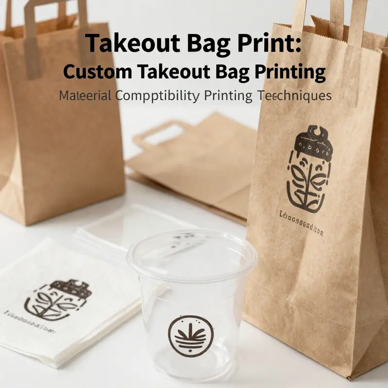
The takeout bag print sits at a crossroads where design, sustainability, and operational practicality meet. The material chosen for a bag—paper, compostable plastic, or recyclable film—defines how color is rendered, how legible the messaging remains, and how the bag withstands grease, heat, and handling. When these realities are understood, printing becomes a strategic tool that reinforces brand promise on every bag.
Paper remains a cornerstone for many operations, especially for brands leaning into earthy or craft aesthetics. Kraft and other porous substrates suit flexographic printing for high-volume runs and bold graphics. Porosity aids ink density and legibility from a distance, but coatings, surface treatment, and paper grade must be aligned with grease resistance and ink adhesion.
Compostable plastics bring sustainability but challenge ink adhesion and durability. Traditional flexography can struggle on film surfaces unless primers and surface treatments are used, or ink chemistries adjusted. Partnering with suppliers to test printability on the exact bag material helps ensure logos stay vibrant through grease exposure and humidity.
Recyclable films and certain biodegradable blends often pair with digital printing, ideal for shorter runs and frequent artwork changes. Digital print can handle a wider range of substrates, while some non-porous surfaces may require pretreatments for robust adhesion.
Ink chemistry matters: water-based inks reduce VOCs but may need surface treatment on non-porous substrates; soy-based inks offer environmental alignment and a warmer character that can complement natural materials.
Innovations in sustainable packaging—composites that blend paper and plastic—require close collaboration with suppliers and testing protocols to ensure grease resistance, durability, and end-of-life goals. The objective is to merge sustainability with performance.
Restaurants face practical factors: hot climates, greasy menus, and the desire for a consistent brand across locations. Durability, legibility, and color fidelity must survive grease, heat, and transit.
Design clarity is non-negotiable. Bold, simple graphics and legible typography maximize recognition, and must align with the chosen material and print method.
From a branding perspective, consistency across outlets reinforces recall and trust. Bags act as moving billboards and touchpoints for engagement, so brand elements should stay stable while allowing for regional updates.
A practical pathway starts with a materials map: decide whether sustainability, durability, or a blend matters most, then identify the compatible printing method and ink system. Commission sampling that mirrors service conditions, observe color fidelity and edge sharpness, and refine the design for scale and transfer into production.
Concrete starting points: some brands opt for fully compostable options with soy inks to align with sustainability narratives, while others choose high-contrast digital prints on recycled stock to ensure uniformity across outlets. The right decision hinges on material compatibility with the printing method, the ink system, lifecycle considerations, and ongoing supplier collaboration.
Takeout Bag Print: Branding That Travels and Converts

Takeout bag printing has quietly become one of the most consequential levers in a restaurant’s marketing toolkit. What begins as a practical container for hot noodles or a sizzling kebab can, with thoughtful design and reliable printing, turn into a moving billboard that travels with every customer, every mile, and every weather condition. In a market where first impressions are often formed not at the door but at the moment of takeaway, the bag becomes a portable ambassador for the brand. The power of this simple medium lies in two interlocking ideas: durability and clarity, both of which must be engineered into the printing strategy from the moment the order is placed. Printing options are not just about making a logo look good on a bag; they are about sustaining legibility and brand cues under grease, moisture, handling, and the unpredictability of daily operations. Flexographic ink printing and hot stamping, when chosen with care, deliver a crisp, recognizable presence even after a few hours of busy service, a drizzle, or a crowded curbside pickup scenario. Each method has its strengths: ink-based methods excel in color richness and scalable production, while hot stamping can offer metallic or tactile accents that catch the eye and convey a tactile sense of premium quality. The decision between them depends on production scale, budget constraints, and the desired sensory impact of the finished bag. The real win comes when these technical choices align with a design that communicates quickly and memorably, because the takeaway moment is brief—the customer glances at the bag as they step onto the sidewalk or scan a bag at the door before tossing it into a tote or bin. In that moment, a strong bag design can reinforce the memory of a brand, prompting a return visit or a social post that multiplies the initial investment.
Customization and branding are not just about placing a logo on a bag. They are about orchestrating a clear, coherent narrative that travels with the customer from the storefront to home, and in some cases, to the digital world. A logo placed with confident spacing, a bold color palette, and minimal but impactful typography can register immediately, even from a distance or in poor lighting. A short slogan or tagline, if legible, reinforces brand personality—whether it is warm and family-oriented, bold and street-smart, or artisanal and premium. The visual language should stay consistent across all touchpoints: bag, storefront signage, menu boards, and online ordering interfaces. When done consistently, bag printing becomes a thread that ties disparate customer experiences into a single brand story. It is particularly potent for small businesses that operate in tight markets where differentiation is crucial. A kebab stand, for instance, can lean on a durable, weather-resistant bag that bears a simple, high-contrast emblem and a bold phone number or QR code, turning a routine pickup into a moment of brand reinforcement amid rainy streets or crowded food courts.
Material compatibility is the practical backbone of any printing plan. The bag’s substrate—whether it is paper, kraft, biodegradable plastic, or a compostable film—must be compatible with the chosen printing method. Ink must adhere securely to the surface, resist seepage or flaking from grease and moisture, and maintain legibility through the bag’s lifecycle, from the kitchen pass to the customer’s hands and into the lunch hour commute. Paper and kraft are popular for their natural aesthetic and recyclability, but they require inks and laminates that resist grease without compromising readability. Biodegradable laminates or compostable films offer a more sustainable path, but only if the inks and coatings are certified food-safe and compatible with the bag substrate. The choice of lamination or no lamination matters too. A gloss finish can enhance color vibrancy and legibility, catching the eye in bright lighting, but it may also reflect glare in sunlight. A matte finish can reduce glare and feel more contemporary, though it can slightly dull color contrast. In every case, testing on actual bag stock with the intended food types is essential. Ink adherence, smudge resistance, and readability under various lighting scenarios must be verified to avoid the common pitfall of a design that looks great in a mockup but fades in production.
Design considerations must balance visual impact with practical communication. Bold graphics, high-contrast color schemes, and simplified imagery help ensure that branding remains legible even when the bag is crumpled or viewed from a distance. The design should include essential contact points that invite online engagement or future orders. A phone number, website, or social handles can drive return visits and broaden the brand’s digital footprint. A QR code is a particularly effective bridge between the physical bag and the digital ecosystem. When scanned, it can direct customers to an online ordering portal, loyalty program, or a social channel that shares promotions and new menu items. The bag thus becomes a cross-channel conduit, extending the restaurant’s reach beyond the dining table into the customer’s everyday life. Design clarity also means using typography that remains legible at small sizes and in quick glances. Avoid crowded typography or overly intricate linework that can blur when printed on the bag’s uneven surface. Instead, favor clean, geometric letterforms with generous letter-spacing. A simple color palette can outperform a crowded spectrum because it communicates more quickly and preserves brand identity across printing runs.
A broader strategic frame emerges when we consider the bag’s role in today’s sustainability expectations. Consumers increasingly view packaging as a signal of values. Eco-friendly, food-safe materials such as kraft paper, responsibly sourced fibers, and biodegradable laminates align with rising consumer demand for environmentally responsible practices. When a restaurant adopts sustainable packaging, the printing strategy should reinforce that choice, not contradict it. The ink system must be compatible with the chosen substrates and should avoid coatings or chemistries that hamper recyclability or compostability. In addition, brands have an opportunity to educate through their packaging—using concise statements about material sources, recycling guidance, or composting instructions, when appropriate. A well-chosen material and a well-executed print can communicate a story of responsibility that resonates with customers who value ethical sourcing and minimal environmental impact.
The logistics of scaling bag printing for growth complicate the decision-making, but they also offer powerful leverage. Bulk ordering reduces per-unit costs and stabilizes branding across all locations, including pop-ups and cloud kitchens that rely on rapid, repeatable packaging. Suppliers that offer scalable production with consistent color and print fidelity help ensure that every bag, from the first to the thousandth, carries an identifiably identical brand stamp. This consistency is particularly important for multi-location operations or chains that expand beyond a single city. The supply chain realities of high-volume takeout packaging are heavily anchored in major manufacturing hubs, with significant activity concentrated in regions known for integrated production ecosystems. These hubs can provide vertical integration—from raw material sourcing through final printing and logistics—allowing for reliable, timely delivery of branded bags. For procurement teams, engaging with verified B2B suppliers in these regions can offer both quality assurance and scalability, enabling seamless integration of print strategies into broader marketing initiatives. The economics of scale matter here; when a single supplier handles material, printing, and logistics, per-unit costs fall and consistency improves, reducing the risk of misbranding across dozens or hundreds of outlets.
This is also where the realities of modern delivery economics come into play. In a climate where cloud kitchens and delivery-only brands proliferate, the takeout bag is often the customer’s first in-person touchpoint with the brand, even before a meal is tasted. Packing quality, grease resistance, and the bag’s ability to withstand a ride through rain or a crowded parking lot can strongly influence the customer’s impression of reliability and care. A well-designed bag signals that the business has thought through the entire customer experience—from kitchen operations to the moment the bag is handed over at the counter. The same bag later frames perceptions when the customer posts a photo or shares a story online; a clear, visually striking design can drive word-of-mouth and social engagement that extends beyond the original sale.
For teams evaluating suppliers, a pragmatic approach combines design discipline with material science. The right combination of substrate and ink yields a bag that remains legible and intact, even after being tucked into a coat pocket or dropped into a rain-soaked tote. The design must also consider the bag’s shape and size. A compact burger bag or a narrow, tall bag for kebabs may benefit from strategic image placement that uses negative space to preserve legibility when stacked or carried. A larger bag for family orders offers more room for a bold brand message but can be visually overwhelming if not balanced with a lighter typographic rhythm. In either case, the goal is to achieve a design that reads like a brand manifesto in a glance—where the customer can quickly capture the essentials and recall them later.
Within this strategic frame, a practical recommendation emerges for businesses seeking to align branding with procurement realities: consider a supplier that offers eco-friendly, food-safe materials, a reliable printing pipeline, and scalable production. A concrete example of an actionable path is provided by a comprehensive industry guide on sourcing high-volume takeout packaging from verified Chinese manufacturers. This resource outlines how manufacturers in provinces such as Guangdong, Shandong, and Hebei can deliver cost-effective, reliable, and timely delivery of branded bags, supporting both national and regional expansion. Access to such a guide can help procurement teams assess capacity, quality assurance, and the feasibility of maintaining consistent branding across locations as demand grows. For designers and marketers, this translates into a clearer brief for suppliers about color fidelity, print methods, and material compatibility, ensuring that the final product aligns with the brand’s strategic objectives. A practical note is to request samples that simulate real-world usage—grease exposure, moisture, stacking, and weather variations—to validate that the chosen print solution will hold up under typical service conditions. When the bag delivers on both aesthetics and function, it becomes more than a container; it becomes a reliable touchpoint that reinforces loyalty and encourages engagement.
To illustrate how these ideas translate into concrete choices, consider the path of a small, delivery-focused operation that seeks to refresh its packaging without sacrificing brand integrity or budget. The operator begins with a design mood board that emphasizes high-contrast imagery and a limited color palette. They test two print methods across the same bag stock—flexographic ink printing for color breadth and hot stamping for tactile and metallic accents. The tests include moisture exposure and grease resistance assessments, ensuring that legibility endures beyond the first bite. The operator also prioritizes material options that align with sustainability goals, selecting kraft paper with a compostable laminate for a clean, earthy aesthetic. The final package layout includes a bold logo placement, a concise tagline, and a QR code that links to the online ordering portal and social channels. The brand’s phone number is set in a typeface with generous tracking to prevent crowding, and the website URL appears in a slightly smaller yet highly legible size. This meticulous but practical approach demonstrates how branding on a bag can be both aesthetically compelling and operationally sound, delivering a measurable lift in repeat orders and online engagement.
The power of a well-executed takeout bag print is not merely about attracting new customers; it is also about cultivating a sense of consistency and trust across multiple orders and locations. When customers encounter a bag that clearly communicates who they are ordering from, they are more likely to recognize the brand in a future encounter, whether through a repeat order or a referral. The bag’s design then becomes a tool for reinforcing brand familiarity, a subtle cue that signals reliability and quality, which in turn nurtures customer loyalty over time. This dynamic is especially important for independent eateries and small chains that compete with larger brands by leveraging the personal, local, and often artisanal feel conveyed by their packaging. In short, takeout bag print is not a marginal aspect of packaging strategy. It is a central element of brand architecture that travels with the customer, multiplying the impact of every meal beyond the dine-in experience and into the daily digital and social rhythms of customers’ lives.
For readers seeking further practical guidance, a targeted internal resource on eco-friendly packaging options can be a valuable companion as you plan a refreshed bag program. eco-friendly takeout boxes for food packaging offers a snapshot of options that balance sustainability with style and practicality. This resource can help refine your material choices, design constraints, and printing compatibility while keeping a close eye on your environmental commitments. As you move from concept to production, remember that the bag is more than a vessel for meals; it is a portable, persuasive extension of your brand that travels with every customer and has the potential to shape perceptions long after the food is gone. The most successful campaigns treat this everyday object with strategic intent, ensuring that every printed bag carries a clear message, a durable construction, and a pathway for ongoing customer engagement.
External resource: For procurement teams seeking reliable partners and up-to-date supplier evaluations in high-volume takeout packaging, this comprehensive guide on sourcing takeout burger bags from Chinese manufacturers provides valuable context and practical criteria to inform supplier selection. https://www.foodservicepackaging.com/sourcing-takeout-burger-bags-china-2026
Final thoughts
Custom printed takeout bags are more than just a means of transporting food—they serve as an extension of your brand that can significantly enhance customer experience. By leveraging various printing options and ensuring compatibility with your chosen materials, you can create a powerful marketing tool that promotes brand recognition and encourages repeat business. As the food service industry continues to evolve, investing in thoughtful takeout bag design and strategic marketing will not only attract attention but also foster customer loyalty. Start exploring how custom takeout bags can make a difference in your business today.